Till Nagel
Visual Analytics
Dr. Till Nagel is a Research Professor of Visual Analytics at the Technische Hochschule Mannheim, where he leads the Human Data Interaction Lab. The lab explores how interactive data representations can support diverse audiences and foster meaningful engagement with data. His work bridges information visualization, interaction design, and data literacy through public exhibitions, participatory workshops, and structured approaches to visualization design. His applied research focuses on urban and mobility data, healthcare contexts, and cultural heritage. He is co-editor of the book Making with Data (2023).
Dr. Nagel is member of the Advisory Board of the ESPRC Centre for Doctoral Training in Diversity in Data Visualization, the Center of Applied Research (BW-CAR) of the Baden-Württemberg Doctoral Association of Universities of Applied Sciences, and an associated member of the Medical Faculty Mannheim of Heidelberg University.
Dr. Nagel received his PhD at the Human Computer Interaction group at KU Leuven. He was a visiting scholar at the MIT Senseable City Lab (2011), and at the National University of Singapore (2011-2012), a postdoctoral fellow at the FHP Urban Complexity Lab, and a guest professor at Burg Giebichenstein University of Arts and Design Halle. He served as General Chair of the IEEE VIS Arts Program (VISAP) 2018 and 2019, and on the VISAP Steering Committee from 2020-2024. His projects have been exhibited internationally, including at Venice Biennale of Architecture, the Shanghai Design Exhibition, and the National Museum of Singapore, and featured in The Guardian, Esquire, and Süddeutsche Zeitung.
Projects
Crafting Futures
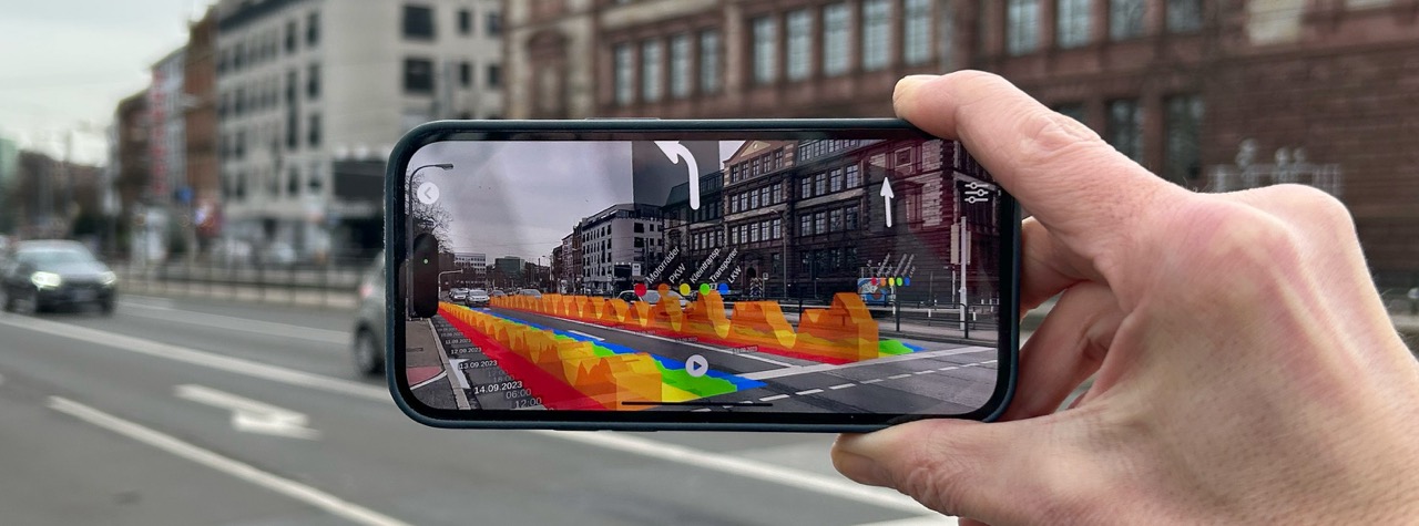
AR DXP
HeatHub
UDV Card Deck
MIRACUM
sMArt roots
modal - Data Literacy Education
PAXmotion
WanderVis
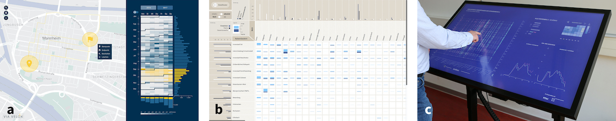
Via Velox
cf. city flows
Publications
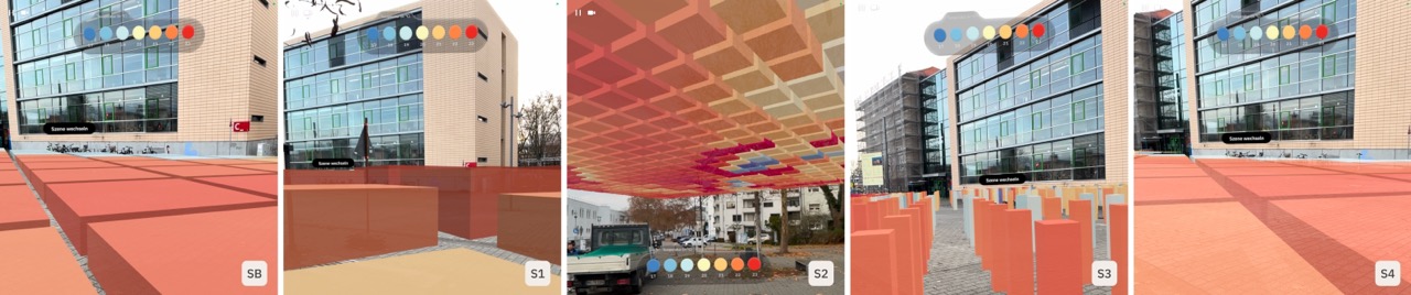
Embedding Climate Data Into Urban Space: A Situated AR Design Probe
EuroVis Shorts, 2026
Crafting Futures - AR-gestützte Klimavisionen im urbanen Raum
IPSC, 2026
Toward a Design Space for Embedded Urban Data Visualizations
IEEE VIS, 2025
Comparing Public Dashboards in the Wild - An Observational Study of Urban Data Visualizations in an Outdoor Exhibition
IV, 2025
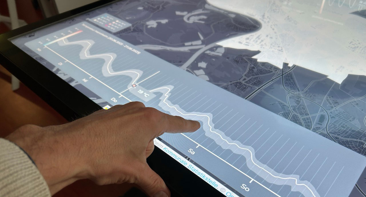
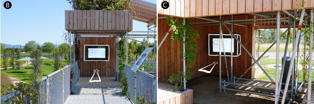
High-Resolution Urban Climate Visualization: A Dual-Screen Approach for Public Engagement
EnvirVis, 2025
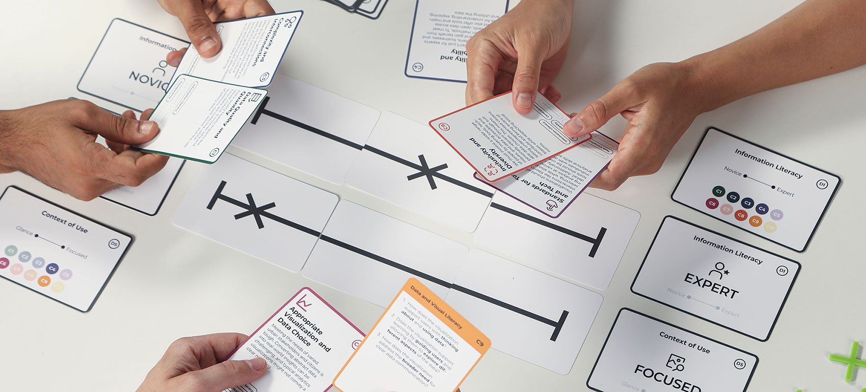
The UDV Card Deck: A Collaborative Design Framework to Facilitate Urban Visualization Conversations
IEEE Computer Graphics and Applications, 2025
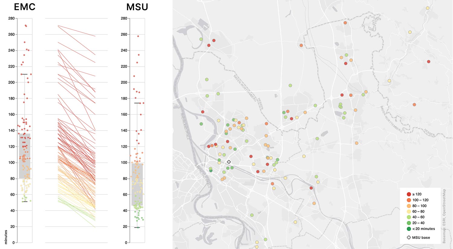
The impact of an MSU service on acute stroke care in a middle-sized city: a simulation-based analysis
Journal of Neurology, 2024
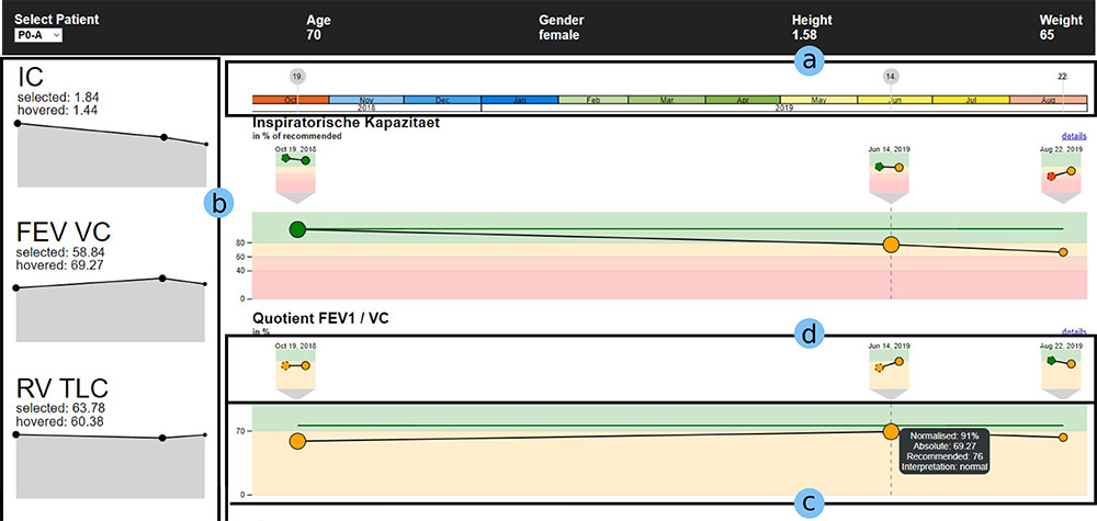
Designing interactive visualizations for analyzing chronic lung diseases in a user-centered approach
Journal of the American Medical Informatics Association, 2024
Embedded temporal data visualizations in an urban environment for casual exploration
EuroVis Shorts, 2024
Hey ChatGPT, can you visualize my data? - A Multi-Dimensional Study on using an LLM for Constructing Data Visualizations.
EuroVis Posters, 2024
Attributes, Methods, and Frameworks Used to Evaluate Wearables and Their Companion mHealth Apps: Scoping Review
Journal of Medical Internet Research, 2024
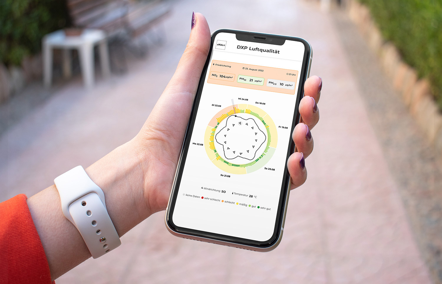
Experiencing Data on Location: A Case Study of Visualizing Air Quality for Citizens
KN - Journal of Cartography and Geographic Information, 2023
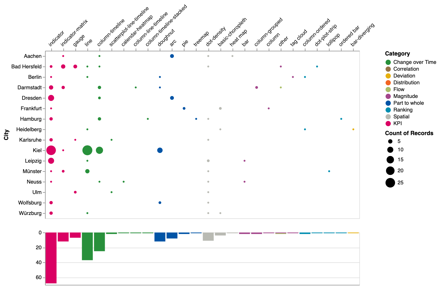
An initial visual analysis of German city dashboards
EuroVis Posters, 2023
Supporting Medical Personnel at Analyzing Chronic Lung Diseases with Interactive Visualizations
EuroVis Posters, 2023

Making a Book Cover with Data
CHI Workshop on Data as a Material for Design, 2023
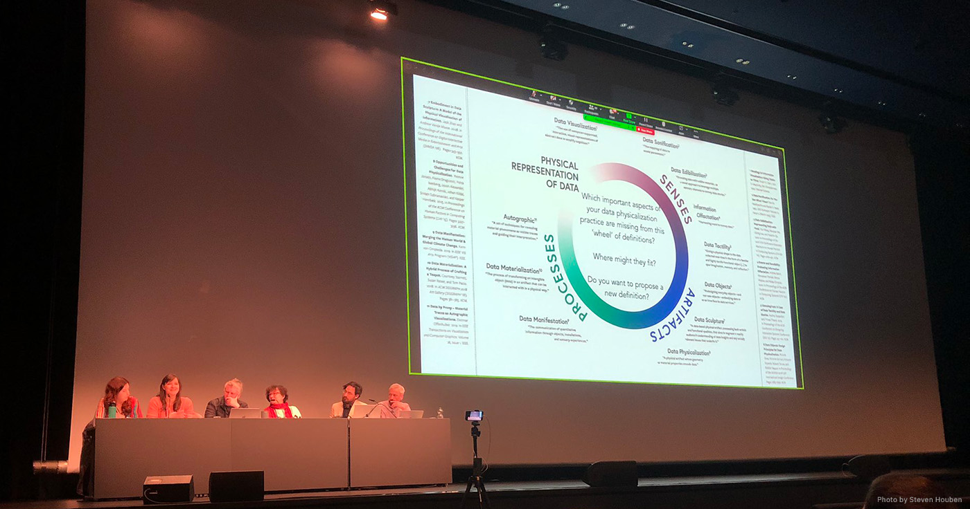
Making with Data (And Beyond)
CHI Panel, 2023
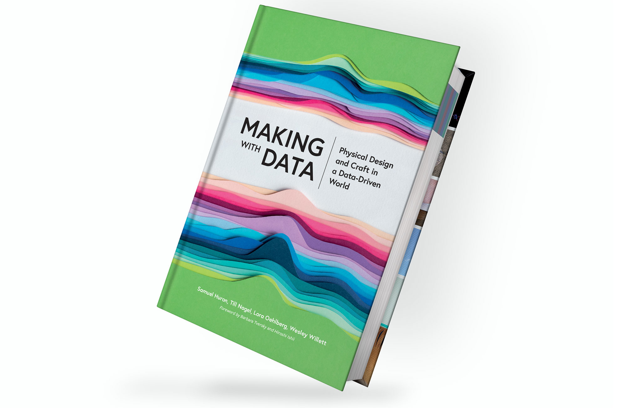
Making with Data: Physical Design and Craft in a Data-Driven World
AK Peters/CRC Press, Routledge, 2022
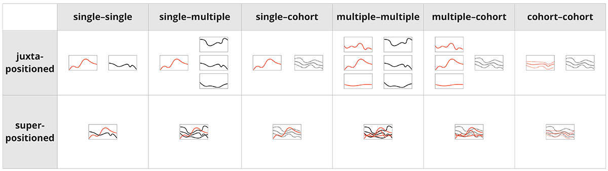
Visualization techniques of time-oriented data for the comparison of single patients to multiple patients or cohorts: a scoping review
Journal of Medical Internet Research, 2022
Unravelling the Human Perspective and Considerations for Urban Data Visualization
IEEE PacificVis, 2021
A visual approach for analyzing readmissions in intensive care medicine
Visual Analytics in Healthcare Workshop (VAHC), 2021
ColVis: Collaborative Visualization Design Workshops for Diverse User Groups
Information Visualisation (IV), 2020
Understanding User Experience of COVID-19 Maps through Remote Elicitation Interviews
BELIV Workshop, 2020
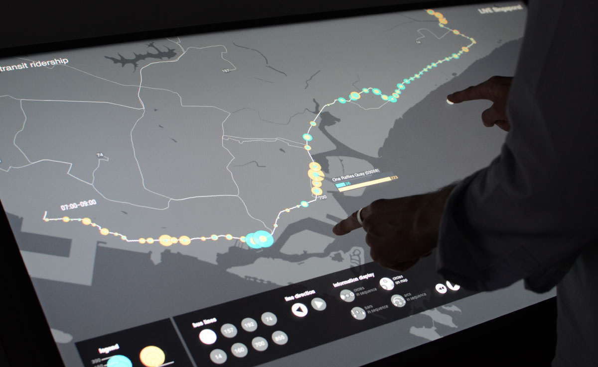
Visually analysing urban mobility: Results and insights from three student research projects
KN J. Cartogr. Geogr. Inf., 2020

Proceedings of the IEEE VIS Arts Program (VISAP) 2019
Proc. of IEEE VISAP, 2019
What is happening in the city? A case study for user-centred geovisualisation design
Journal of Location Based Services, 2019
Environmental Art as Physicalization Technique
Dagstuhl Reports, 2019

Proceedings of the IEEE VIS Arts Program (VISAP) 2018
Proc. of IEEE VISAP, 2018
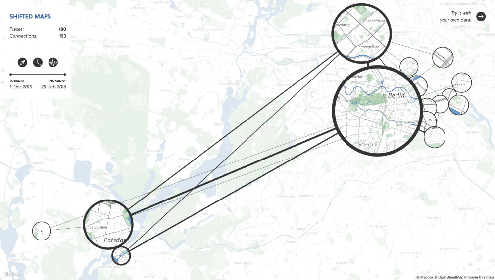
Shifted Maps: Revealing spatio-temporal topologies in movement data
IEEE VISAP, 2018
What We Learned Through User-Centred Evaluation of Geovisualizations
CityVis Workshop at IEEE VIS, 2018
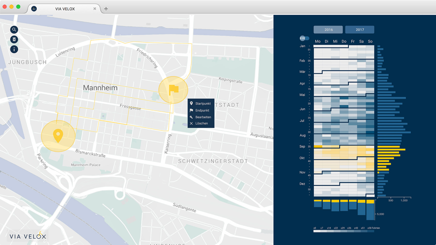
ViaVelox - A system to visually analyze GPS-tracked bike rides
IEEE VIS Poster, 2018
WanderVis - Interaktive Visualisierung von Bevölkerungsbewegungen
Planerin, 2018
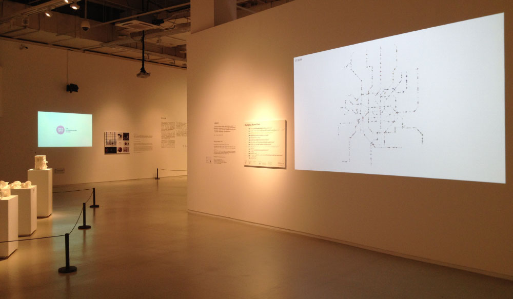
Shanghai Metro Flow – Multiple Perspectives into a Subway System
Leonardo, 2017
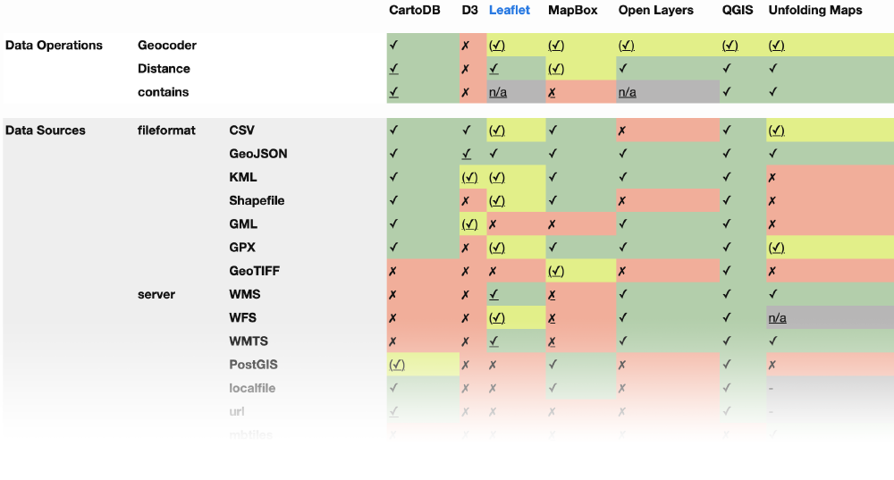
Open Geo Tools — A State of the Art Report. The democratization of geo-tools and data continues
German Cartography conference, 2016
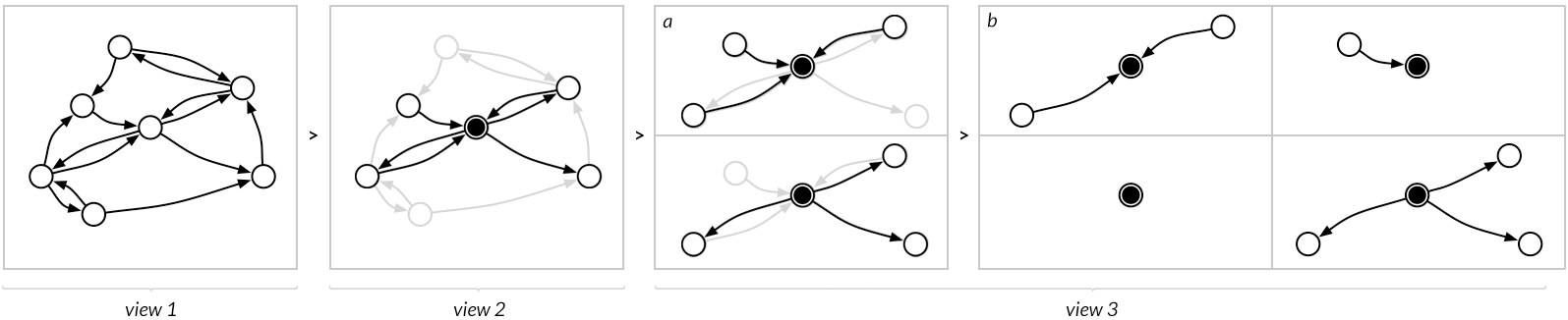
Staged Analysis: From Evocative to Comparative Visualizations of Urban Mobility
IEEE VISAP, 2016
From Origins to Destinations - The Past, Present and Future of Visualizing Flow Maps
Built Environment 42(3), 2016
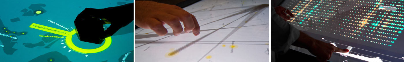
Making three Cases for Casual Geovisualizations on Interactive Surfaces
ACM ITS 2015, 2015
Are there networks in maps? An experimental visualization of personal movement data
IEEE 2015, 2015
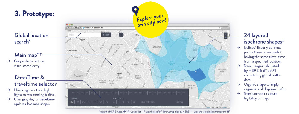
Isoscope – Visualizing temporal mobility variance with isochrone maps
IEEE 2014, 2014