PAXmotion
A visualization system for public transit planners and policy makers to better understand and explore passenger demands. Running on large multi-touch tabletop, the system enables experts to investigate how delays and passenger load might affect each other through a zoomable Marey chart.
PAXMotion is visualization system designed to support urban transit planners and policy makers to better understand and explore passenger demands. It visualizes boarding and deboarding passengers as well as deviations from the time plan in order to allow analyzing the possible interplay between these. PaxMotion is an interdisciplinary research project developed by students of the Mannheim University of Applied Sciences in cooperation with the Rhein-Neckar-Verkehr GmbH.
Update: PaxMotion won the CityCVis competition!
The visualization system
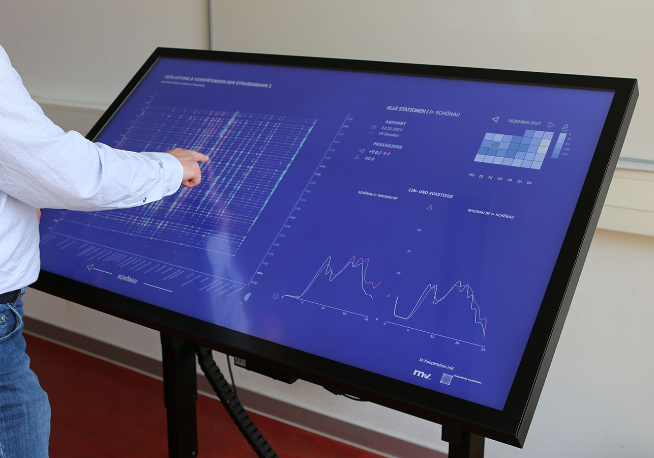
PAXMotion on the interactive multitouch display
The system is designed for a large, high-resolution multitouch display. It consists of three views:
- An extended Marey chart visualizes the time table and real-time information for all trains running on a line. Glyphs show the amount of boarding and deboarding passengers for each stop at a specific time. The Marey chart (aka Ibry chart) is zoom- and scrollable to allow detailed views of delay data in the same scale as the time table.
- A dual line chart shows boarding and deboarding passengers per hour at a selected station for both directions. Thus, temporal characteristics of this station can be easily seen e.g. emerging commuting patterns.
- A heatmap calendar visualizes passenger volume, and helps to understand general temporal patterns, such as working day and weekend behaviour.
Additionally, detailed information are shown in an infobox. It shows summary stats if no station is selected.
All views are interactive and connected. Analysts can select a specific day in the calendar which updates the Marey chart, then choose a station to investigate by tapping on the glyph or on the label, so that its data is shown in the dual line chart as well as in the infobox.
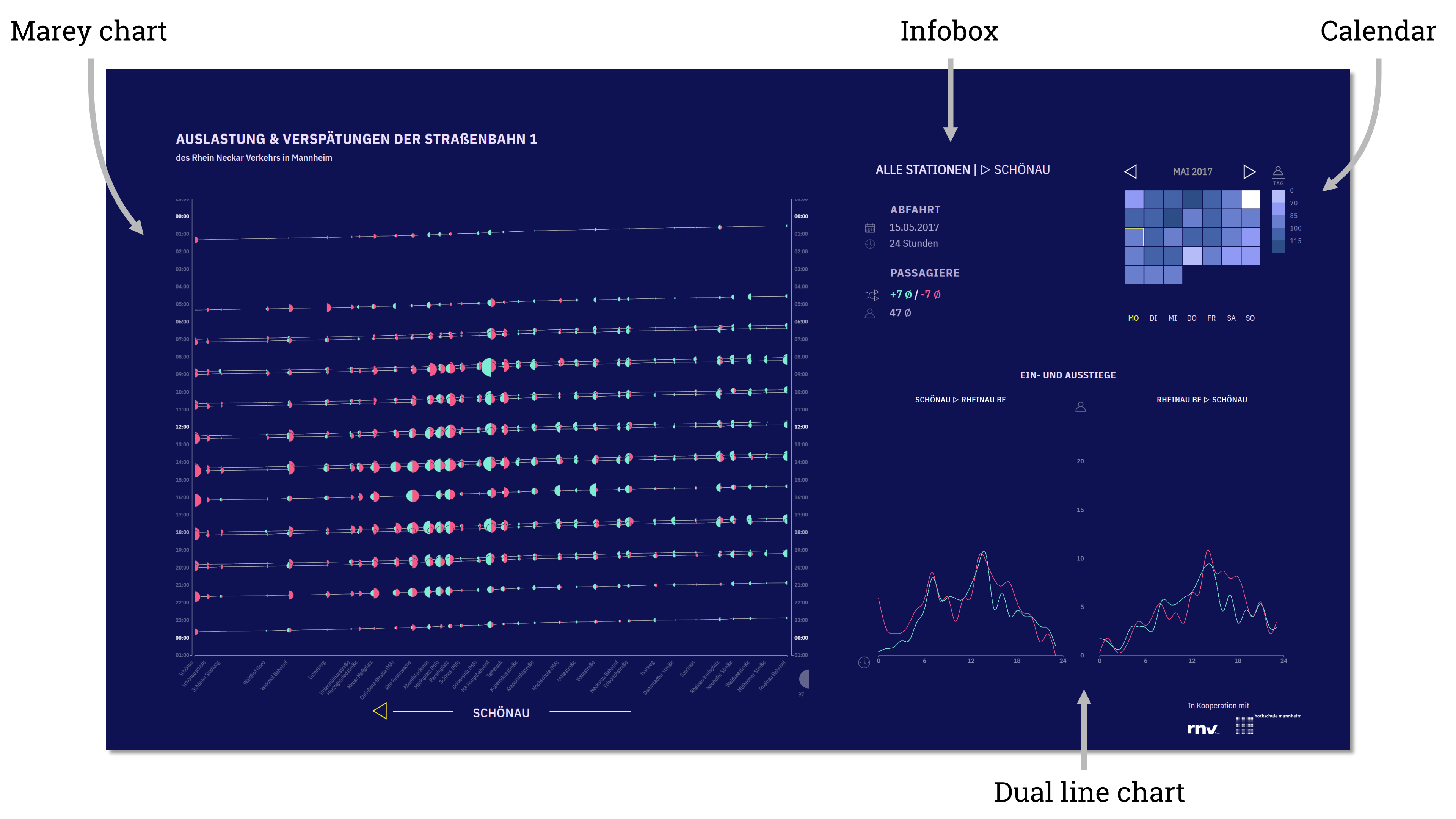
Main view showing the Marey chart on the left, the calendar at the top right, and the dual line chart on the bottom right.
After selecting a day of interest in the calendar, all views update to show the boarding (green) and deboarding (red) passengers for a tram line over the course of that specific day. The Marey chart shows planned and actual departure times for each trip, with the glyphs visualizing number of passengers. The dual line chart shows boarding and deboarding passengers over 24h for both direction; either aggregated for all stations, or for the currently selected one.
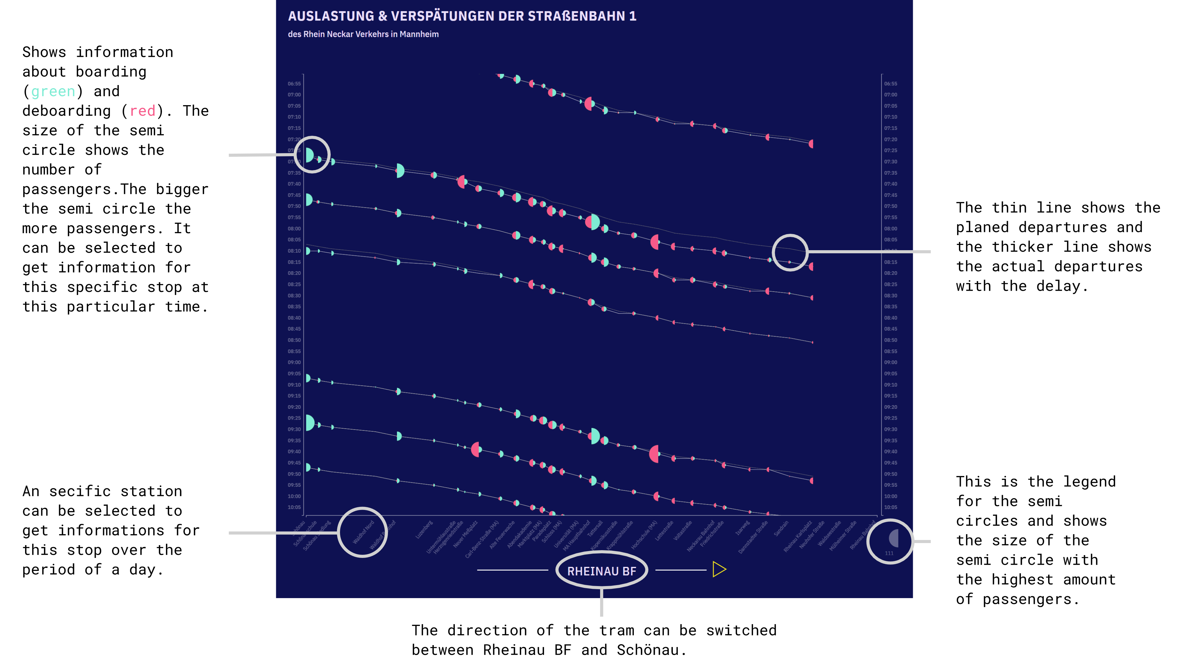
Extended Marey chart showing real-time and timeplan data of trams with their boarding and deboarding passengers.
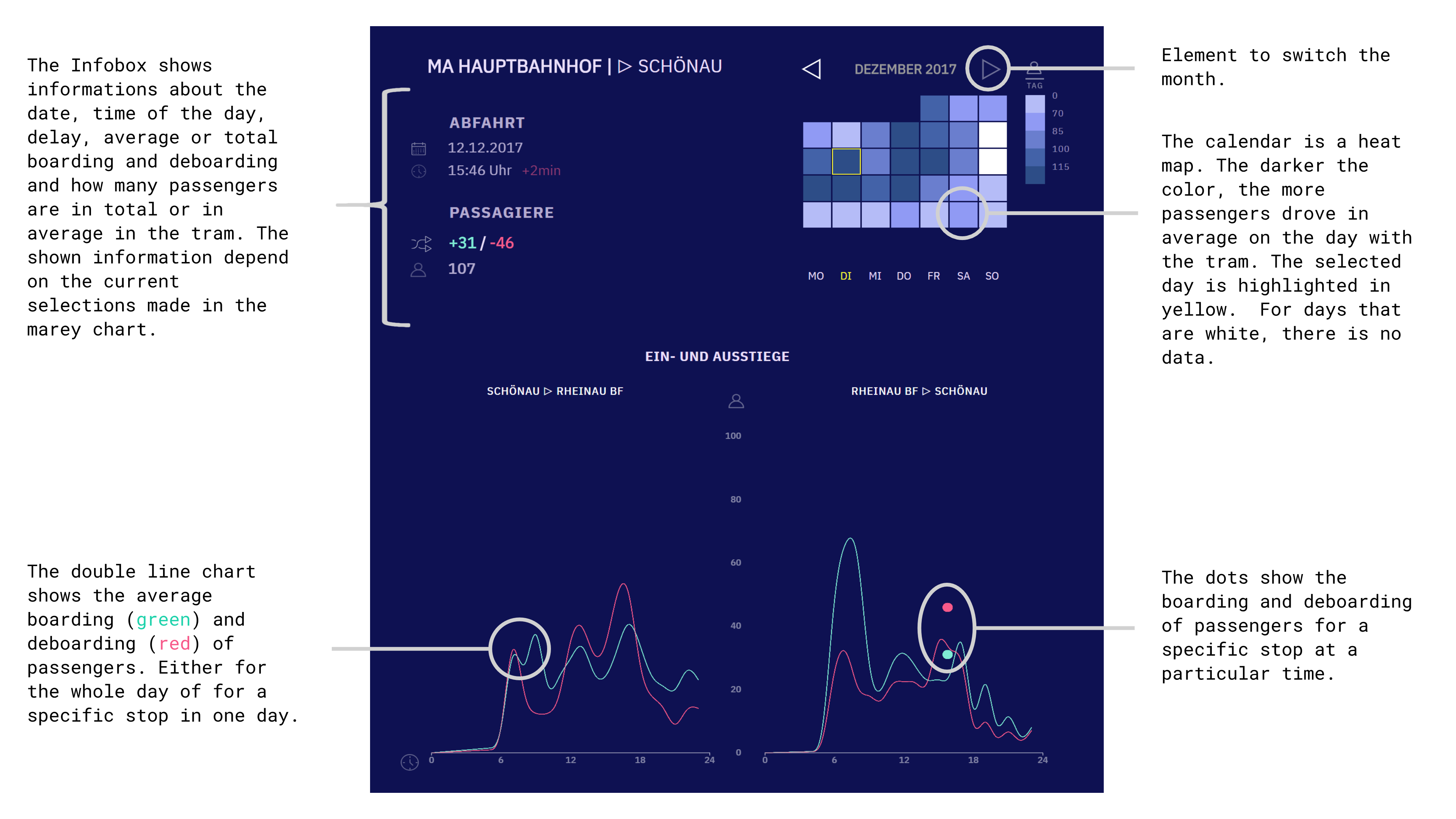
Infobox, heat map calendar, and line charts for additional visual information.
The design process
This is an interdisciplinary project by computer science and design students. It was part of an advanced project-based course where students work on data-driven solutions for real-world problems. This course is part of the trimodal level in our data literacy program.
Find more information on the design process, the technical implementation, as well as a video of the prototype in action, and a selection of the insights made possible with the system at the PAXMotion documentation site.
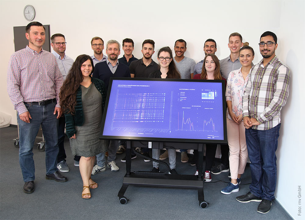
The team of computer science and design students presenting their work at the partner’s headquarter.