Publications
Toward a Design Space for Embedded Urban Data Visualizations
Nagel, T., Huber, C., Eder, M. (2025) Toward a Design Space for Embedded Urban Data Visualizations. IEEE Conference on Visualization and Visual Analytics (VIS), Nov 2025, Vienna, Austria, 11/2025 (upcoming)
We propose a design space for embedded data visualizations in urban environments, structured across multiple dimensions that articulate key contextual and representational characteristics. The design space is grounded in situated and immersive visualization theory, urban informatics, and co-creative ideation workshops. Its dimensions describe different aspects of how data visualizations relate to the physical urban environment and to the viewer. We illustrate the applicability of the design space using mappings to speculative embedded urban visualizations. This conceptual contribution is intended to support designers and researchers in structuring, analyzing, and generating embedded urban visualizations, and serves as a basis for future extensions.
Comparing Public Dashboards in the Wild - An Observational Study of Urban Data Visualizations in an Outdoor Exhibition
Huber, C., Nagel, T., Stuckenschmidt, H. (2025) Comparing Public Dashboards in the Wild - An Observational Study of Urban Data Visualizations in an Outdoor Exhibition. International Conference on Information Visualisation (IV)., 08/2025 (upcoming)
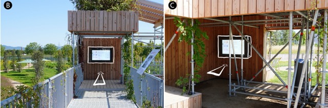
Urban data visualization poses distinct challenges, especially when it aims to engage the public effectively. This research investigates the impact of the placement of public displays on attracting visitors and facilitating comprehension. We designed two interactive dashboards tailored to visualize local and real-time information, to support questions collected through participatory workshops. These dashboards were then exhibited at a large semi-public event, with two distinct placements being analysed to assess visitor engagement. Our methodology comprised of an in-the-wild study, wherein the two placements were compared to gauge visitor understanding and interaction with the dashboards. The results of this research provide insights into optimizing the placement of public displays for effective data visualization and public engagement.
High-Resolution Urban Climate Visualization: A Dual-Screen Approach for Public Engagement
Huber, C., Nagel, T., Stuckenschmidt, H. (2025) High-Resolution Urban Climate Visualization: A Dual-Screen Approach for Public Engagement. EuroVis Workshop on Visualisation in Environmental Sciences (EnvirVis). doi: 10.2312/envirvis.20251149, 06/2025
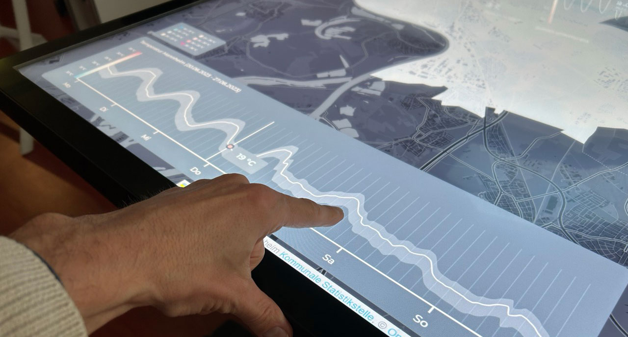
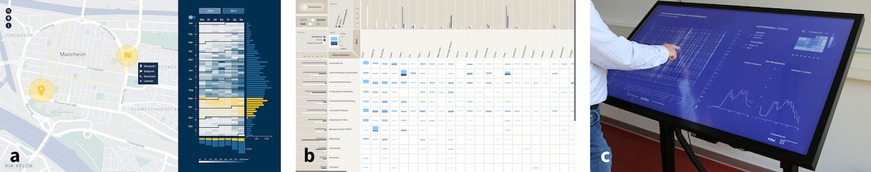
Rising urban temperatures and climate variability increasingly affect city residents, yet accessible tools for understanding local climate dynamics remain scarce. This paper presents an interactive visualization of Mannheim’s urban microclimate, designed primarily for citizens to explore climate patterns in their neighborhoods. The system is based on a high-resolution, AI-supported climate model that integrates real-time sensor data on temperature, perceived temperature, humidity, wind conditions, and global radiation. To provide intuitive access to climate variability, the visualization presents data for a full summer week, revealing diurnal patterns and variations across different weather conditions. The system aims to balance context and detail and is deployed on an interactive touch-table, complemented by an auxiliary screen in order to display the entire city for an overview, allowing users to focus on selected districts while maintaining comparability and contextualization. By mapping fine-scale climate variations onto familiar administrative units, the tool enables citizens to better understand microclimatic changes and their local implications. This work contributes to environmental visualization by combining geospatial modeling with intuitive visual representations to foster climate literacy and informed urban adaptation strategies. We discuss design choices, user engagement considerations, and the potential for extending the system to predictive modeling and scenario-based exploration
PublicationThe UDV Card Deck: A Collaborative Design Framework to Facilitate Urban Visualization Conversations

Çay, D., Nagel, T., Meier, S. (2025) The UDV Card Deck: A Collaborative Design Framework to Facilitate Urban Visualization Conversations. IEEE Computer Graphics and Applications. DOI: 10.1109/MCG.2025.3556573, 03/2025
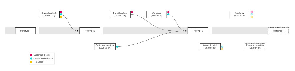
This article presents the Urban Data Visualization (UDV) card deck, a tool designed to facilitate reflective discussions and inform the collaborative design process of urban data visualizations. The UDV card deck was developed to bridge the gap between theoretical knowledge and practice in workshop settings, fostering inclusive and reflective approaches to visualization design. Drawing from urban visualization design literature and the results from a series of expert workshops, these cards summarize key considerations when designing urban data visualizations. The card deck guides different activities in an engaging, collaborative, and structured format, promoting inclusion of diverse urban actors. We introduce the card deck and its goals, demonstrate its use in four case studies, and discuss our findings. Feedback from workshop participants indicates that the UDV card deck can serve as a supportive and reflective tool for urban data visualization researchers, designers and practitioners.
Publication ProjectThe impact of an MSU service on acute stroke care in a middle-sized city: a simulation-based analysis
Szabo, K., Nagel, T., Grund, A., Kravatzky, A., Sandikci, V., Radder, M., Rink, J., Hoyer, C. (2024) The impact of an MSU service on acute stroke care in a middle-sized city: a simulation-based analysis. Journal of Neurology. DOI: 10.1007/s00415-024-12515-w, 06/2024
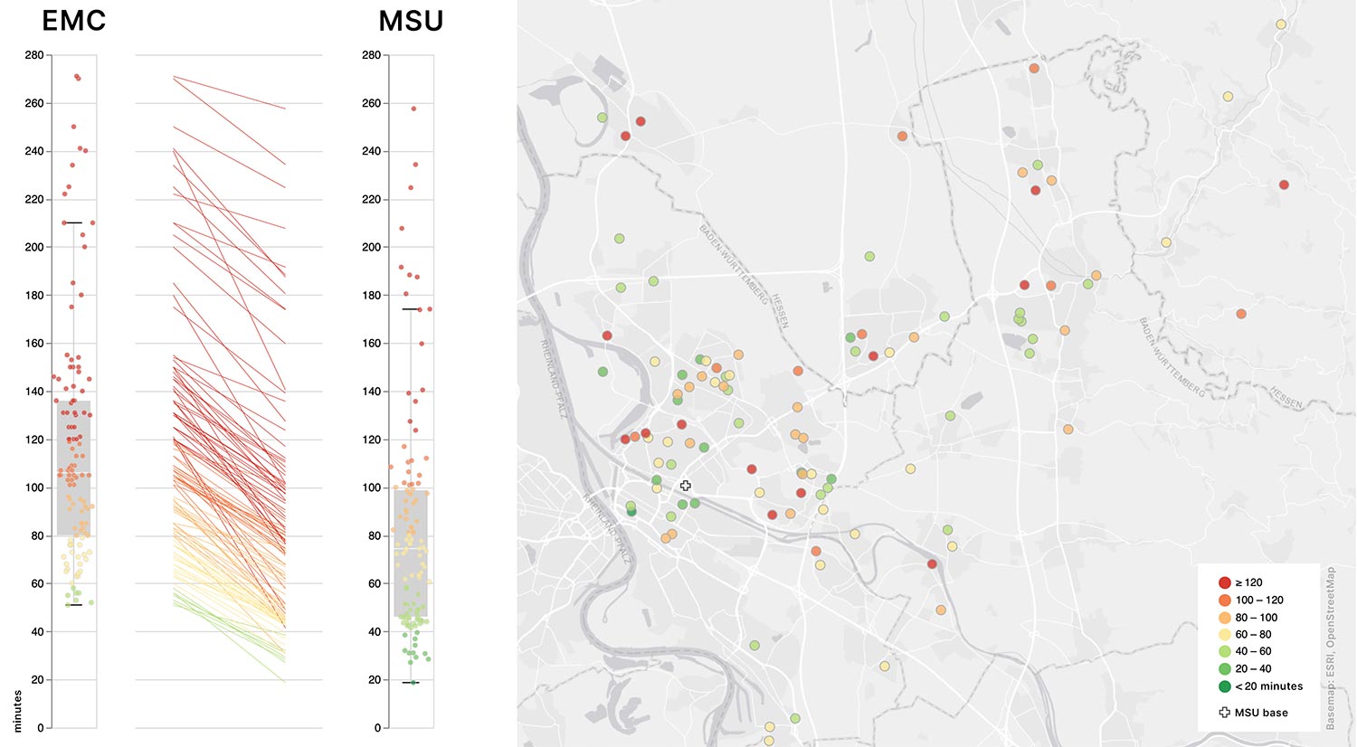
This study investigates the potential impact of Mobile Stroke Unit (MSU)-assisted stroke care in Mannheim. In this retrospective cohort study, data from patients with confirmed acute cerebrovascular events were analyzed. Real-world emergency medical care (EMC) data and modelled MSU scenario data are compared with respect to relevant prehospital and treatment process metrics. Results indicate that MSU care significantly reduces alarm-to-needle times for thrombolyzed patients and increases the rate of golden hour thrombolysis, despite longer travel times to the scene. Our findings suggest that MSU utilization is generally scalable to and beneficial for prehospital stroke care for novel scenarios beyond those already established.
PublicationDesigning interactive visualizations for analyzing chronic lung diseases in a user-centered approach
Warnking, R. P., Scheer, J., Becker, F., Siegel, F., Trinkmann, F., and Nagel, T. (2024) Designing interactive visualizations for analyzing chronic lung diseases in a user-centered approach, Journal of the American Medical Informatics Association. DOI: 10.1093/jamia/ocae113, 05/2024
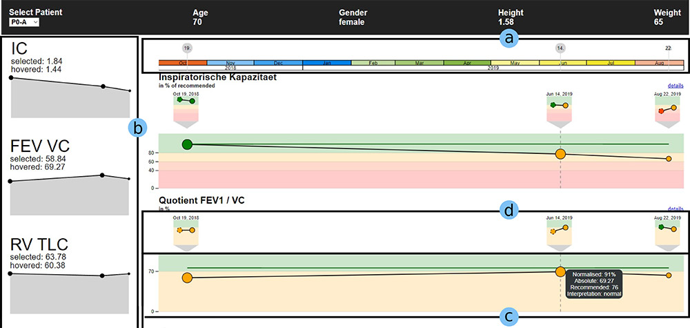
Objectives. Medical practitioners analyze numerous types of data, often using archaic representations that do not meet their needs. Pneumologists who analyze lung function exams must often consult multiple exam records manually, making comparisons cumbersome. Such shortcomings can be addressed with interactive visualizations, but these must be designed carefully with practitioners’ needs in mind. Materials and Methods. A workshop with experts was conducted to gather user requirements and common tasks. Based on the workshop results, we iteratively designed a web-based prototype, continuously consulting experts along the way. The resulting application was evaluated in a formative study via expert interviews with 3 medical practitioners. Results. Participants in our study were able to solve all tasks in accordance with experts’ expectations and generally viewed our system positively, though there were some usability and utility issues in the initial prototype. An improved version of our system solves these issues and includes additional customization functionalities. Discussion. The study results showed that participants were able to use our system effectively to solve domain-relevant tasks, even though some shortcomings could be observed. Using a different framework with more fine-grained control over interactions and visual elements, we implemented design changes in an improved version of our prototype that needs to be evaluated in future work. Conclusion. Employing a user-centered design approach, we developed a visual analytics system for lung function data that allows medical practitioners to more easily analyze the progression of several key parameters over time.
PublicationHey ChatGPT, can you visualize my data? - A Multi-Dimensional Study on using an LLM for Constructing Data Visualizations.
Ströbel, M., Eckert, K., and Nagel, T. (2024) Hey ChatGPT, can you visualize my data? - A Multi-Dimensional Study on using an LLM for Constructing Data Visualizations., EuroVis Posters, The Eurographics Association, DOI: 10.2312/evp.20241083, 05/2024
This paper explores the effectiveness of an LLM in creating data visualizations across a spectrum of scenarios, characterized by three key dimensions: the complexity of the underlying data, the user’s data visualization competencies, and the requirements of the resulting visualization. Based on an empirical study, we offer insights into the potential role of LLMs as tools for empowering users with varied expertise to effectively visualize data.
Publication PosterEmbedded temporal data visualizations in an urban environment for casual exploration
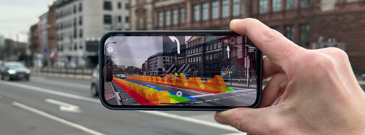
Nagel T., Huber, C., Petzold, E., Humbert, S. (2024) Embedded temporal data visualizations in an urban environment for casual exploration. EuroVis Shorts, The Eurographics Association, DOI: 10.2312/evs.20241066, 05/2024
We investigate situated and embedded visualizations to enhance casual urban data engagement. Presenting a design concept for embedding temporal data visualizations onto flat surfaces, we explore features that integrate these visualizations within their physical contexts. Through a mobile application utilizing location-based augmented reality to visualize traffic, we demonstrate the feasibility of our designs in real-world settings. This approach not only aims to improve understanding of urban phenomena but also to enrich user experiences, offering a novel method for urban data visualization that emphasizes user engagement.
Publication Project Preview VideoAttributes, Methods, and Frameworks Used to Evaluate Wearables and Their Companion mHealth Apps: Scoping Review
Moorthy P, Weinert L, Schüttler C, Svensson L, Sedlmayr B, Müller J, Nagel T. Attributes, Methods, and Frameworks Used to Evaluate Wearables and Their Companion mHealth Apps: Scoping Review. JMIR Mhealth Uhealth 2024;12:e52179. https://doi.org/10.2196/52179, 04/2024
The goal of this scoping review is to identify the type of wearables and their frequency of use in studies, along with mobile health applications, and their combinations and the attributes and evaluation methods of usability within the healthcare domain. Our scoping review identified the type of wearables and their frequency of use in studies, along with the use cases for which the wearables were used in the medical context. Additionally, we examined the evaluation of these wearables in the form of usability methods, attributes, and frameworks. Within the array of available wearables and mobile health applications, healthcare providers and manufacturers encounter the challenge of selecting devices and companion apps that are effective, user-friendly, and compatible with user interactions. The current gap in usability and user experience research limits our understanding of the strengths and limitations of wearable technologies. Furthermore, additional research is necessary to overcome these limitations and improve researchers’ understanding of this field.
PublicationExperiencing Data on Location: A Case Study of Visualizing Air Quality for Citizens
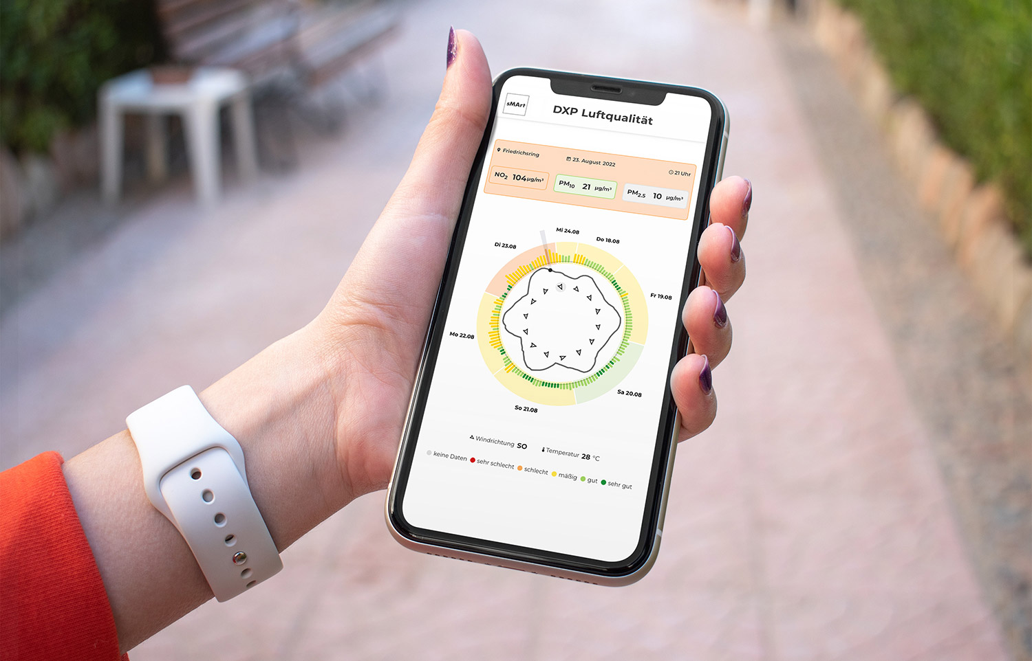
Huber, C., Nagel, T. & Stuckenschmidt, H. Experiencing Data on Location: A Case Study of Visualizing Air Quality for Citizens. KN J. Cartogr. Geogr. Inf. (2023). DOI: 10.1007/s42489-023-00140-y, 06/2023
Visualizing urban data has different purposes. Besides more traditional goals such as supporting experts to decide on smart city policies, supporting citizens to understand aspects of the city relevant to one’s everyday life needs different visualization approaches. In contrast to urban dashboards, which typically show various data sources in a more or less unified way, visualizations tailored for one specific task may be more appropriate for citizens. This paper introduces data experience points where people can experience data on location on their own device, and explore and understand urban phenomena through visualizations. Based on an expert workshop, we propose a set of design goals for these data experience points, and demonstrate the concept through a case study of visualizing air quality data. We designed and implemented multiple prototypes in this case study, and gathered feedback at a public outreach event.
PublicationAn initial visual analysis of German city dashboards
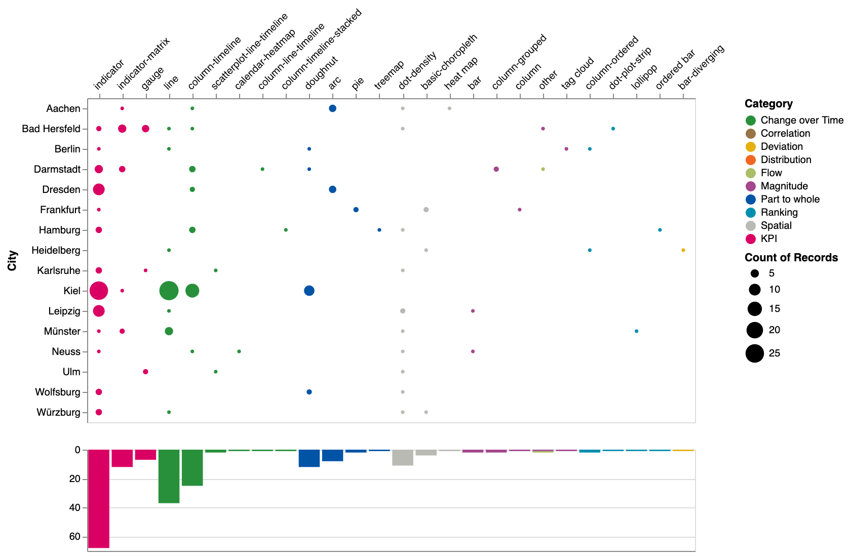
Huber, C., Nagel, T., and Stuckenschmidt, H. (2023) An initial visual analysis of German city dashboards, EuroVis Posters, The Eurographics Association. DOI:10.2312/evp.20231056, 06/2023
City dashboards are powerful tools for quickly understanding various urban phenomena through visualizing urban data using various techniques. In this paper, we investigate the common data sets used, and the most frequently employed visualization techniques in city dashboards. We review 16 publicly available dashboards from 42 cities that are part of German smart city programs and have a high level of digitization. Through analysis of the visualization techniques used, we present our results visually and discuss our findings.
publication posterSupporting Medical Personnel at Analyzing Chronic Lung Diseases with Interactive Visualizations
Warnking, R. P., Scheer, J., Trinkmann, F., Siegel, F., and Nagel, T. (2023) Supporting Medical Personnel at Analyzing Chronic Lung Diseases with Interactive Visualizations, EuroVis Posters, The Eurographics Association. DOI: 10.2312/evp.20231069, 06/2023
We present a visualization system for medical practitioners to analyze lung function data collected at different points in time. In particular, our approach aims to solve the problems practitioners encounter in their daily work life when they have to consult different text-based documents to get access to the same data we provide in a single interface. To test the suitability of our system, we conducted a formative study where participants used our system to answer both simple and complex questions previously designed in collaboration with a domain expert. Our results indicate that our target users can easily work with our system and use it to answer both types of questions.
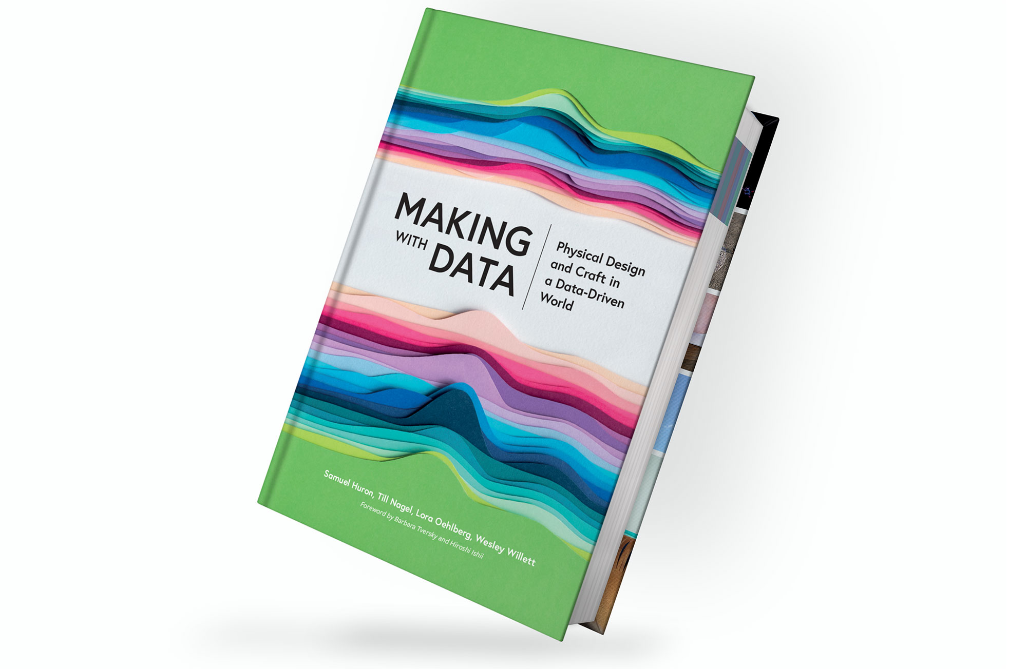
publicationMaking a Book Cover with Data

Huron, S., Nagel, T., Oehlberg, L., Willet, W., Bressa, N. (2023). Making a Book Cover with Data. CHI Workshop on Data as a Material for Design, 04/2023 (upcoming)
In this pictorial, we describe the process of creating the cover of the book Making with Data: Physical Design and Craft in a Data Driven World. The book cover is a physical data-driven papercraft sculpture that visualizes the undulating word counts of each section of each chapter. We present our process of using data as material for designing the book cover in nine phases. Our goal was to allow viewers and readers to ‘judge the book by its cover’, and experience the book’s theme aesthetically and evocatively, even before opening it.
publication workshopMaking with Data (And Beyond)
Oehlberg, L., Willet W., Huron, S., Nagel T., Thudt, A., Ijeoma, E., Offenhuber, D., Hornecker, E. (2023). Making with Data (And Beyond). CHI Panel, 04/2023
In this panel, we will discuss the practice of Making with Data – the practice of creating physical artifacts that represent a dataset. This topic lies at the intersection of several CHI communities: data visualization, fabrication, and tangible interaction. Our goal is to discuss contemporary practices, but also to envision future ways that we might continue to make physical representations of data in the future, given emerging fabrication techniques, data representation practices, and desired interactions and experiences with data.
PDF publicationMaking with Data: Physical Design and Craft in a Data-Driven World
Huron, S., Nagel, T., Oehlberg, L., & Willett, W. (Eds.). (2023). Making with Data: Physical Design and Craft in a Data-Driven World. AK Peters/CRC Press, Routledge, 12/2022
Our book “Making with Data: Physical Design and Craft in a Data-Driven World” provides a snapshot of the diverse practices contemporary creators are using to produce objects, spaces, and experiences imbued with data. Across 25+ beautifully illustrated chapters, international artists, designers, and scientists each explain the process of creating a specific data-driven piece—illustrating their practice with candid sketches, photos, and design artifacts from their own studios. Featuring influential voices in computer science, data science, graphic design, art, craft, and architecture, Making with Data is accessible and inspiring for enthusiasts and experts alike.
Book Website TwitterVisualization techniques of time-oriented data for the comparison of single patients to multiple patients or cohorts: a scoping review
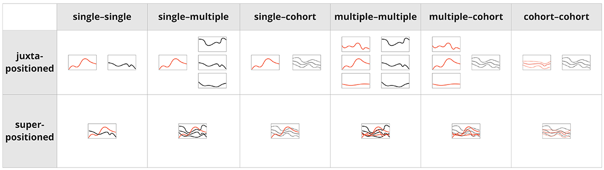
Scheer J, Volkert A, Brich N, Weinert L, Santhanam N, Krone M, Ganslandt T, Boeker M, Nagel T Visualization Techniques of Time-Oriented Data for the Comparison of Single Patients With Multiple Patients or Cohorts: Scoping Review Journal of Medical Internet Research. 2022;24(10):e38041 DOI:10.2196/38041, 10/2022
This review aims to provide an overview of visualization techniques for time-oriented data in health care, supporting the comparison of patients. We systematically collected literature and report on the visualization techniques supporting the comparison of time-based data sets of single patients with those of multiple patients or their cohorts and summarized the use of these techniques. The articles under review in general mitigated complexity through visualization and supported diverse medical objectives. We identified 3 distinct patient entities: single patients, multiple patients, and cohorts. Cohorts were typically visualized in condensed form, either through prior data aggregation or through visual summarization, whereas visualization of individual patients often contained finer details. All the systems provided mechanisms for viewing and comparing patient data. However, explicitly comparing a single patient with multiple patients or a cohort was supported only by a few systems. These systems mainly use basic visualization techniques, with some using novel visualizations tailored to a specific task. Overall, we found the visual comparison of measurements between single and multiple patients or cohorts to be underdeveloped, and we argue for further research in a systematic review, as well as the usefulness of a design space.
Publication Microsite ToolMe-ifestos for Visualization Empowerment in Teaching (and Learning?)
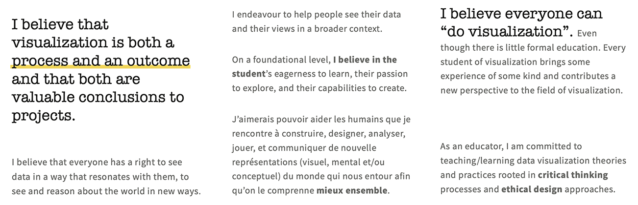
Jan Aerts, Wolfgang Aigner, Benjamin Bach, Fearn Bishop, Magdalena Boucher, Peter C.-H. Cheng, Alexandra Diehl, Jason Dykes, Sarah Hayes, Uta Hinrichs, Samuel Huron, Christoph Kinkeldey, Andy Kirk, Søren Knudsen, Doris Kosminsky, Tatiana Losev, Areti Manataki, Andrew Manches, Isabel Meirelles, Luiz Morais, Till Nagel, Rebecca Noonan, Georgia Panagiotidou, Laura Pelchmann, Fateme Rajabiyazdi, Christina Stoiber, Tatiana Landesberger, Jagoda Walny, and Wesley Willett. Me-ifestos for Visualization Empowerment in Teaching (and Learning?). Proceedings of alt.VIS, a IEEE VIS 2022 workshop, 10/2022
One sunny June afternoon in a remote castle deep in Saarland, a group of visualization researchers of many stripes - from different countries, disciplines and generations - came together to discuss teaching and learning for empowerment in visualization. Our first order of business in Saarland was to develop a shared vision: a manifesto of sorts that would guide us towards strategies to broaden data visualization skills, make them more common and accessible, and enable this empowerment. That exercise failed. Instead of creating one common manifesto (who are we to do that, anyway?), we took a different, more personal approach. We found things we liked and things we didn’t: inspiration and counter-inspiration, we crafted individual value and commitment statements (“me-ifestos”), we shared these with each other and reflected on them. The process of writing these commitment statements was illuminating and motivating. It was a positive experience with such visceral effects that we want to share the feeling with the visualization community. And so we offer a collection of “me-ifesto” excerpts from the authors and a call to action: we invite you to craft and divulge your own me-ifesto.
PDFUnravelling the Human Perspective and Considerations for Urban Data Visualization
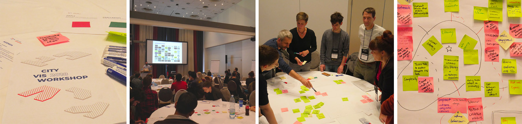
14th IEEE Pacific Visualization Symposium (PacificVis), 126-130. DOI:10.1109/PacificVis52677.2021.00024, 04/2021
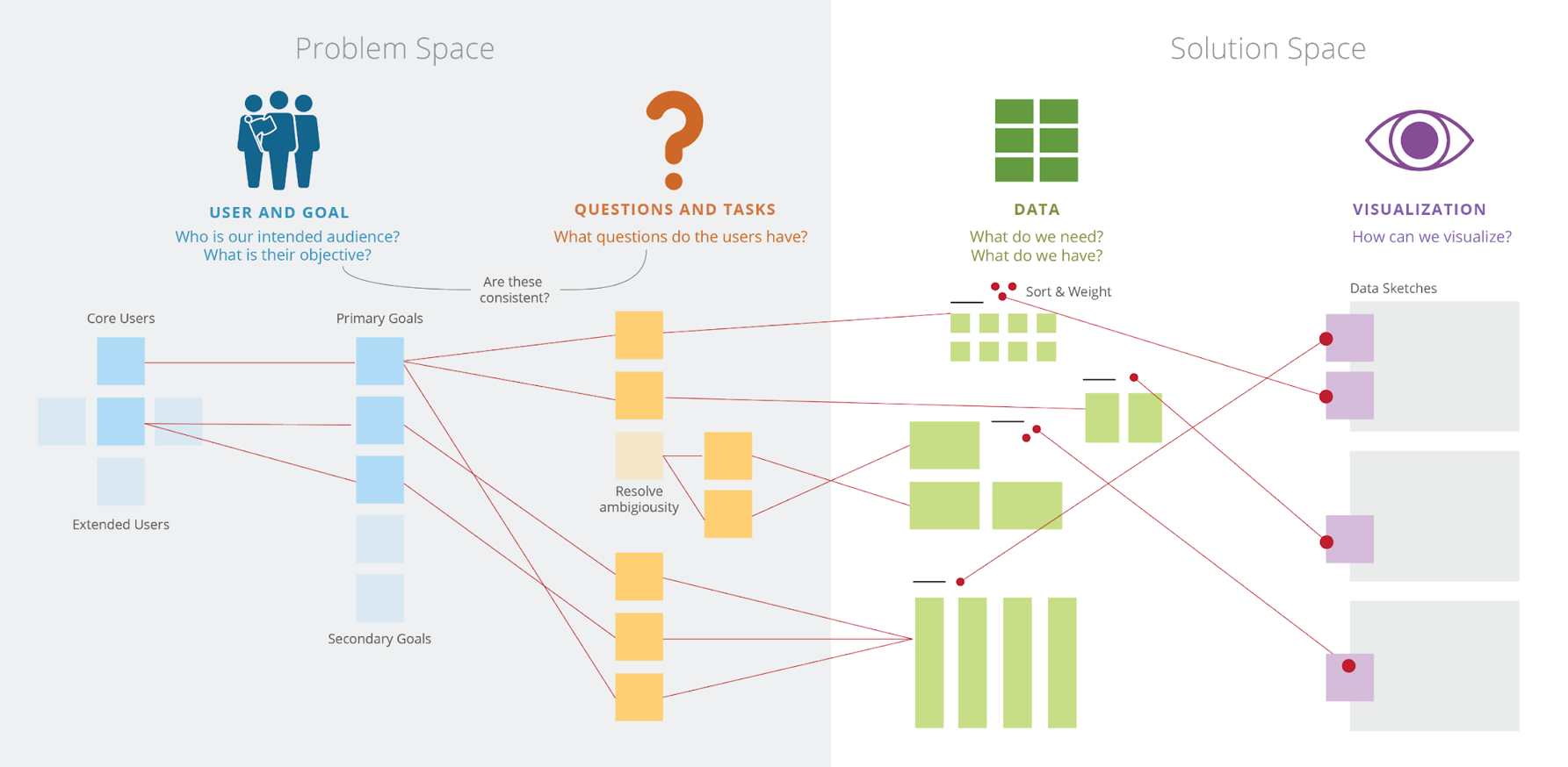
Effective use of data is an essential asset to modern cities. Visualization as a tool for analysis, exploration, and communication has become a driving force in the task of unravelling our complex urban fabrics. This paper outlines the findings from a series of three workshops from 2018-2020 bringing together experts in urban data visualization with the aim of exploring multidisciplinary perspectives from the human-centric lens. Based on the rich and detailed workshop discussions identifying challenges and opportunities for urban data visualization research, we outline major human-centric themes and considerations fundamental for CityVis design and introduce a framework for an urban visualization design space.
Publication PDFA visual approach for analyzing readmissions in intensive care medicine
Visual Analytics in Healthcare Workshop (VAHC 2020), AMIA Annual Symposium, 24-25, DOI:10.1109/VAHC53729.2020.00010, 01/2021
Intensive care units (ICUs) are under constant pressure to balance capacity. ICUs have a limited number of resources and therefore effective monitoring of planned and unplanned transfers is crucial. Transfers can result in critical readmissions, i.e. “down” transfers from ICUs to a normal ward or an intermediate care unit (IMC) and back “up” to an ICU within a short time span. In this work, we present a tool to visually analyze critical ICU readmissions. Patient transfer data is extracted from a clinical data warehouse via HL7-FHIR. The interactive prototype consists of a timeline of readmission cases, an aggregated view of transfer flows between wards, and histograms and calender heatmaps to show a set of key performance indicators. The aim of our tool is to support identifying peaks, discovering temporal patterns, comparing wards, and investigating potential causes. We report on our user centered approach, describe the data pipeline, present the visualization and interaction techniques of the functional prototype, and discuss initial feedback.
PublicationUnderstanding User Experience of COVID-19 Maps through Remote Elicitation Interviews
IEEE Workshop on Evaluation and Beyond - Methodological Approaches to Visualization (BELIV), 65–73, 06/2020
During the coronavirus pandemic, visualizations gained a new level of popularity and meaning for a wider audience. People were bombarded with a wide set of public health visualizations ranging from simple graphs to complex interactive dashboards. In a pandemic setting, where large amounts of the world population are socially distancing themselves, it becomes an urgent need to refine existing user experience evaluation methods for remote settings to understand how people make sense out of COVID-19 related visualizations. When evaluating visualizations aimed towards the general public with vastly different socio-demographic backgrounds and varying levels of technical savviness and data literacy, it is important to understand user feedback beyond aspects such as speed, task accuracy, or usability problems. As a part of this wider evaluation perspective, micro-phenomenology has been used to evaluate static and narrative visualizations to reveal the lived experience in a detailed way. Building upon these studies, we conducted a user study to understand how to employ Elicitation (aka Micro-phenomenological) interviews in remote settings. In a case study, we investigated what experiences the participants had with map-based interactive visualizations. Our findings reveal positive and negative aspects of conducting Elicitation interviews remotely. Our results can inform the process of planning and executing remote Elicitation interviews to evaluate interactive visualizations. In addition, we share recommendations regarding visualization techniques and interaction design about public health data.
PublicationColVis: Collaborative Visualization Design Workshops for Diverse User Groups
Proceedings of the 24th International Conference Information Visualisation (IV), 547–555, 06/2020
Understanding different types of users’ needs can even be more critical in today’s data visualization field, as exploratory visualizations for novice users are becoming more widespread with an increasing amount of data sources. The complexity of data-driven projects requires input from including interdisciplinary expert and novice users. Our workshop framework helps taking design decisions collaboratively with experts and novice users, on different levels such as outlining users and goals, identifying tasks, structuring data, and creating data visualization ideas. We conducted workshops for two different data visualization projects. For each project, we conducted a workshop with project stakeholders who are domain experts, then a second workshop with novice users. We collected feedback from participants and used critical reflection on the process. Later on, we created recommendations on how this workshop structure can be used by others. Our main contributions are, (1) the workshop framework for designing data visualizations, (2) describing the outcomes and lessons learned from multiple workshops.
PublicationVisually analysing urban mobility: Results and insights from three student research projects
KN - Journal of Cartography and Geographic Information, 70(1), 11–18, 03/2020
Since the digitalization of urban mobility, such systems generate large and heterogenous data sets. Handling these, however, is still a major challenge. To help people making sense of urban data, skills in data literacy are needed. In this paper, we present results and insights from a set of mobility visualization projects, students from computer science and design developed over one semester. The resulting prototypes visualize (a) user-generated bike trajectories, (b) population movement, and (c) public transit passengers. After a brief justification on why we find urban mobility a practical domain for teaching data literacy, we introduce the course and describe its set and setting. For each project, we report on the challenge, the data, the visualization prototype, and the impact these projects had. Our contribution is twofold: in the description of the problem-oriented course and its results, and in the reflection of our approach and our lessons learnt.
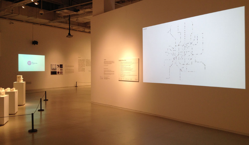
PublicationProceedings of the IEEE VIS Arts Program (VISAP) 2019

Nagel, T., Chung Han, Y., and Lantin, M. (2019) Proceedings of the IEEE VIS Arts Program (VISAP) 2019, IEEE. DOI:10.1109/VISAP48330.2019, 10/2019
The VIS Arts Program (VISAP) is the largest Associated Event of the IEEE VIS Conference. It provides a forum where visualization academics and practitioners, designers, and artists can come together to discuss relevant topics in data visualization. It aims to foster new thinking, discussion, and collaboration between the artistic and scientific communities. VISAP consists of a papers track, a pictorials track, and an exhibition track. Every year, these different tracks are loosely focused around a governing theme that asks contributors to contemplate topics of interest to both visualization academics and creative practitioners. The theme for 2019 was Beyond Borders.
Website Proceedings CatalogueWhat is happening in the city? A case study for user-centred geovisualisation design
Journal of Location Based Services (13:4), 270-292, 07/2019
For citizens, being aware of what is happening in their urban surroundings becomes challenging as more information from diverse sources becomes available. In this paper, we describe our user-centered approach of designing an interactive tool making use of urban data visualisations to facilitate people’s decisions about social and cultural events. After gathering the needs of urban actors through formative user studies, we identified beneficial data types and collected a variety of data sets from publicly accessible online sources. For the aim of enabling casual exploration of events in the city, we designed a set of geovisualisation prototypes and designed a variety of evaluative user studies based on established geovisualisation techniques. The main aim here is to enable casual exploration of events in the city more than the intended search for specific events. We developed two prototypes that make use of two different geovisualisations to represent events: Prototype A uses common location markers, and prototype B uses a novel glyph design to visualize more types of data at a glance. We share the lessons learned from the results of our study, which will inform the design of geographical data visualisations for citizens.
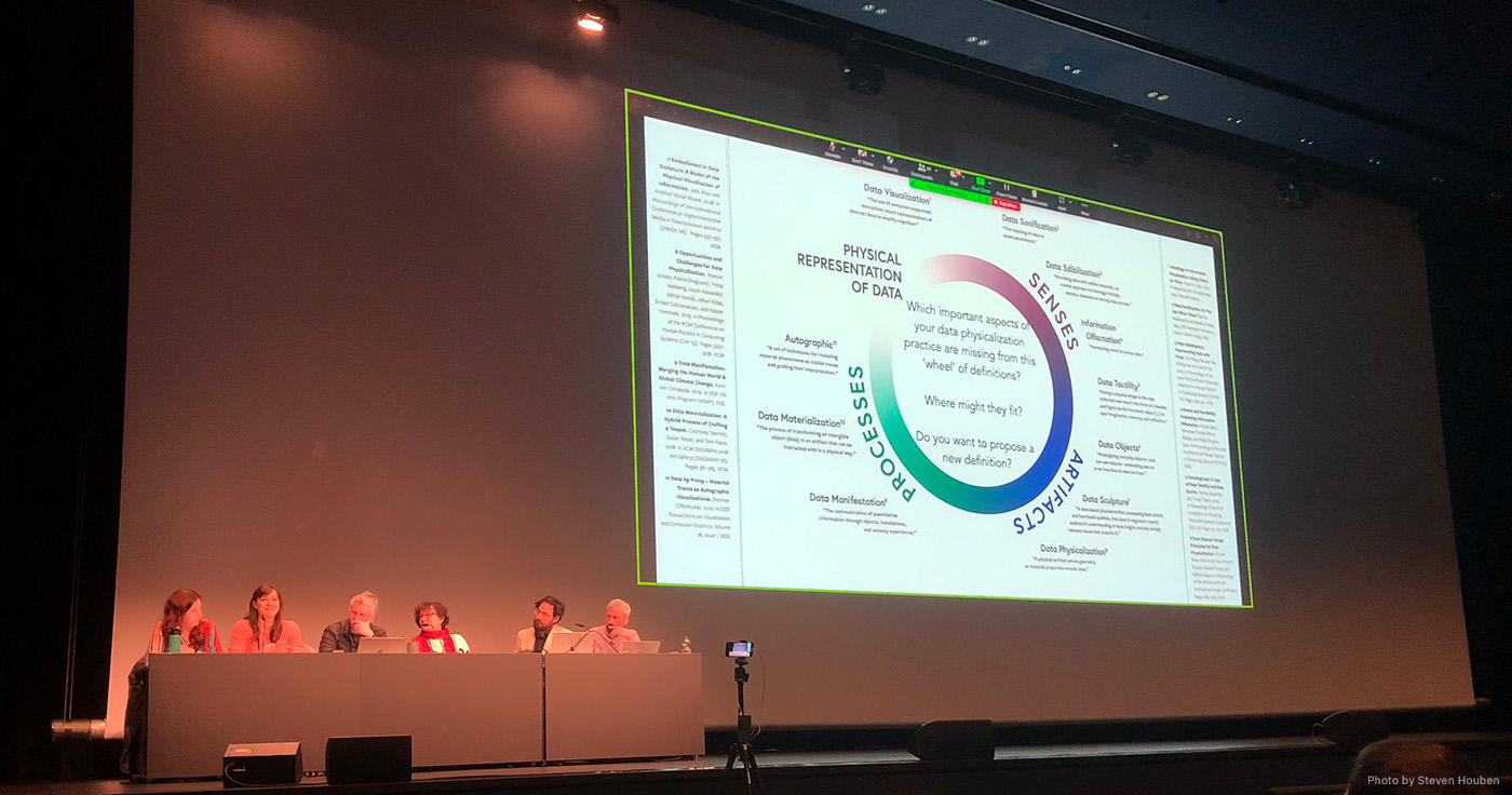
PublicationEnvironmental Art as Physicalization Technique
In: Alexander, J. et al (Eds.). Data Physicalization (Dagstuhl Seminar 18441), Dagstuhl Reports, Volume 8, Issue 10, 2019, 03/2019
Data physicalization involves representing numbers and relationships using physical, tangible displays. These displays provide tactile, as well as visual metaphors for expressing and experiencing data, and can unlock new analytical insights and emotional responses. This Dagstuhl seminar brought together a diverse group of researchers and practitioners to explore the benefits and challenges of physicalization.
PublicationProceedings of the IEEE VIS Arts Program (VISAP) 2018

Boy, J., and Nagel, T. (2018) Proceedings of the IEEE VIS Arts Program (VISAP) 2018, IEEE. DOI:10.1109/VISAP45312.2018, 10/2018
The VIS Arts Program (VISAP) is the largest Associated Event of the IEEE VIS Conference. It provides a forum where visualization academics and practitioners, designers, and artists can come together to discuss relevant topics in data visualization. It aims to foster new thinking, discussion, and collaboration between the artistic and scientific communities. VISAP consists of a papers track, a pictorials track, and an exhibition track. Every year, these different tracks are loosely focused around a governing theme that asks contributors to contemplate topics of interest to both visualization academics and creative practitioners. The theme for 2019 was Data and Identities.
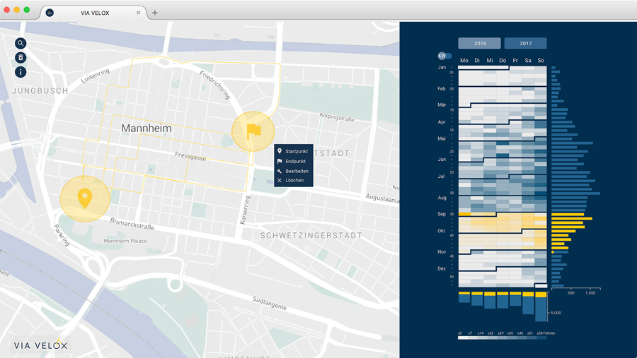
Website Proceedings CatalogueViaVelox - A system to visually analyze GPS-tracked bike rides
Poster Abstracts of IEEE VIS 2018, 10/2018
This paper presents Via Velox, a system visualizing rides tracked and shared by cyclists through a mobile app. It shows a map and a calendar view side by side, and enables to interactively filter spatial and temporal properties of the rides to allow analyzing bicycle traffic. We explain the functionality of the prototype, and briefly discuss some of the insights people had while using the system at a bicycle festival.
Project Paper Poster WebsiteWhat We Learned Through User-Centred Evaluation of Geovisualizations
Proceedings of the CityVis Workshop at the IEEE VIS 2018, 10/2018
Similar to any other design domain, evaluation is an essential phase in the user-centered design process of geo-visualization tools. Different types of evaluation methods can be insightful for different phases of the design process. In this study, we share lessons learned about the evaluation methods employed during the design process of an urban data visualization that facilitates citizens’ decisions on urban socio-cultural events.
PublicationShifted Maps: Revealing spatio-temporal topologies in movement data
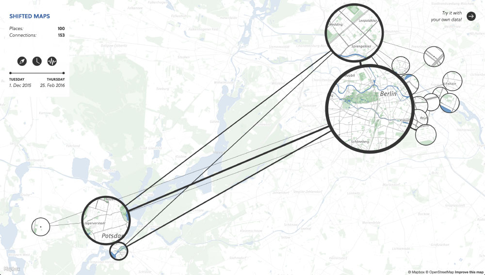
Proceedings of the IEEE VIS Arts Program (VISAP), 10/2018
We present a hybrid visualization technique that integrates maps into network visualizations to reveal and analyze diverse topologies in geospatial movement data. With the rise of GPS tracking in various contexts such as smartphones and vehicles there has been a drastic increase in geospatial data being collect for personal reflection and organizational optimization. The generated movement datasets contain both geographical and temporal information, from which rich relational information can be derived. Common map visualizations perform especially well in revealing basic spatial patterns, but pay less attention to more nuanced relational properties. In contrast, network visualizations represent the specific topological structure of a dataset through the visual connections of nodes and their positioning. So far there has been relatively little research on combining these two approaches. Shifted Maps aims to bring maps and network visualizations together as equals. The visualization of places shown as circular map extracts and movements between places shown as edges, can be analyzed in different network arrangements, which reveal spatial and temporal topologies of movement data. We implemented a web-based prototype and report on challenges and opportunities about a novel network layout of places gathered during a qualitative evaluation.
Publication WebsiteWanderVis - Interaktive Visualisierung von Bevölkerungsbewegungen
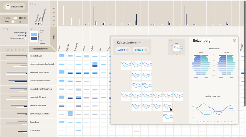
Planerin Fachzeitschrift für Stadt-, Regional- und Landesplanung (2), 27-30, 04/2018
Für die Stadt Kaiserslautern werden soziodemografische Daten aufbereitet und ausgewertet, sodass Einwohnerzahlen oder Bewegungssalden als interaktive Visualisierungen nutzerzentriert zugänglich gemacht werden. Datenvisualisierung erleichtert die Interpretation von Informationen und unterstützt so eine stärkere Nutzung in der Praxis.
Project Website PublicationShanghai Metro Flow – Multiple Perspectives into a Subway System
Leonardo, MIT Press Journals, Volume: 50, Issue: 5, p.511-512, 10/2017
One of the main characteristics of cities is the large amount of people moving around. These flows are reflected in all the subways dashing through the city. With our visualizations we want to give an impression of this pulse of the city. In this art show submission, we present Shanghai Metro Flow, which consists of an animation, and an accompanying infographic poster. The animation is composed of three scenes, each giving another perspective into the metro network. The static poster shows details on the subway lines. Each visualization combines established techniques with an highly aesthetic form in order to attract people to observe and dwell on different aspects of urban mobility.
pdf VideoStaged Analysis: From Evocative to Comparative Visualizations of Urban Mobility
Proceedings of the IEEE VIS Arts Program (VISAP), Baltimore, USA, 10/2016
In this paper we examine the concept of staged analysis through a case study on visualizing urban mobility exhibited in a public gallery space. Recently, many cities introduced bike-sharing in order to promote cycling among locals and visitors. We explore how citizens can be guided from evocative impressions of bicycling flows to comparative analysis of three bike-sharing systems. The main aim for visualizations in exhibition contexts is to encourage a shift from temporary interest to deeper insight into a complex phenomenon. To pursue this ambition we introduce cf. city flows, a comparative visualization environment of urban bike mobility designed to help citizens casually analyze three bike-sharing systems in the context of a public exhibition space. Multiple large screens show the space of flows in bike-sharing for three selected world cities: Berlin, London, and New York. Bike journeys are represented in three geospatial visualizations designed to be progressively more analytical, from animated trails to small-multiple glyphs. In this paper, we describe our design concept and process, the exhibition setup, and discuss some of the insights visitors gained while interacting with the visualizations.
Project PublicationOpen Geo Tools — A State of the Art Report. The democratization of geo-tools and data continues
Proceedings of the 64th German Cartography conference, 10/2016
In our talk we want to give an overview of the current state of open mapping tools. To systematize the expanding field of modern geo tools, we are proposing a new taxonomy, which helps us cluster and categorize the tools, as well as highlighting various dimensions of their functionality. In our talk, we will show examples of how these tools can be used in research as well as professional use cases. By showing how far this field has come, we are trying to highlight how a field that was formerly expert only, has become an open space for collaborations, bringing together geo experts, researchers from other fields, designers as well as citizens themselves. We will also discuss some of the critical issues with this process, such as the overuse of a single map projection, suboptimal generalization, inappropriate color choices, and generally trying to re-invent some well-established techniques due to knowledge gaps. By providing this state of the art report, we are attempting to point out how important it is for us as a professional and academic community to participate in this emerging field, and help foster an exchange of knowledge with the community who create those tools and datasets.
websiteFrom Origins to Destinations - The Past, Present and Future of Visualizing Flow Maps
Built Environment volume 42(3), special issue on Big Data and the City, pp. 338-355, 09/2016
Flow maps are an established cartographic method to depict movements over time and space. In recent years, the exponential increase of geospatial information – what we call urban ‘big data’ – has introduced new uses and highlighted the need to expand cartography. In this paper, we define existing visualization strategies and tools, and examine their characteristics. From this, we identify challenges and opportunities for data-driven flow maps and suggest future developments. Specifically, we apply a new taxonomy to compare several geospatial data visualizations from the MIT Senseable City Lab and extract principles that can define the capabilities of a new interactive flow mapping tool. We have begun to work on such a tool – called the Datacollider – that is public, powerful, intuitive, and scalable. In the latter portion of this paper, we describe the Datacollider, detail its limitations, and outline directions for future development. We conclude by extrapolating broader trends for the field of geospatial data visualization. We articulate a shift from visualization as a set of graphic tools for representing found insights, to visualization as a way of engaging with data and deriving knowledge.
pdf publicationAre there networks in maps? An experimental visualization of personal movement data
Proceedings of the IEEE VIS 2015 Personal Visualization Workshop, 10/2015
Shifted Maps proposes a novel visualization method to generate personal geovisualizations of individual movement data. The resulting visual appearance can be characterized as a map network consisting of visited places and their connections. The visited places are shown as circular map extracts scaled according to the time spent there and the movements between the places are represented as edges between the places. A key feature of the Shifted Maps visualization is the possibility to explore the data in three different arrangements based on geo-spatial position, travel time, and frequency of movements. By combining map and network visualizations of movement data, it becomes possible to analyze and compare spatial and temporal topologies.
pdf Project VideoMaking three Cases for Casual Geovisualizations on Interactive Surfaces
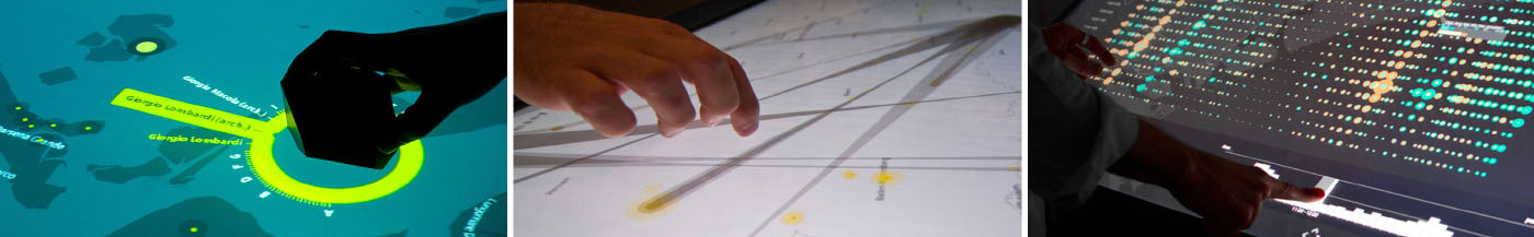
In Proceedings of the ACM ITS 2015 Workshop on Data Exploration for Interactive Surfaces, pp. 24 – 27, 10/2015
In this paper, we present three case studies on visualizing spatiotemporal data on interactive tabletops and surfaces for casual use. While there is a growing interest among citizens to make sense of their social community and urban environment, most existing geovisualization tools have been designed for experts such as planners and analysts. We introduce situation-specific visualization systems that were particularly designed for public exhibitions to balance powerful data exploration methods with inviting accessibility for laypeople. Finally, we discuss some of the lessons learned regarding people’s interest, interaction conventions, and information aesthetics.
pdfIsoscope – Visualizing temporal mobility variance with isochrone maps
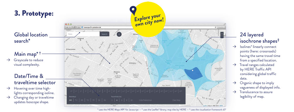
Poster Abstracts of IEEE VIS 2014, 09/2014
Isochrone maps are an established method to depict areas of equal travel time, and have been used in transportation planning since the early 20th century. In recent years, interactive isochrone maps allowed users to select areas of interest, or explore temporal mobility patterns for different modes of transport. However, conventional isochrone maps depict one traffic situation at a time. Our visualization approach unifies isochrone maps with time-varying travel data, and instead of showing multiple isolines for different travel times, we show multiple isolines for different times of day in order to reveal time-dependent spatial travel variance. In this paper, we present Isoscope, a web application that provides an interactive map for casual exploration of urban mobility patterns. Through its aesthetic visual form and its simple interface we strive to support people investigating travel time in their own city. We will describe our design goals, elaborate on the design and implementation of our prototype, and discuss limitations and future extensions of the system.
pdf Project PosterTouching Transport – A Case Study on Visualizing Metropolitan Public Transit on Interactive Tabletops
In Proceedings of the International Working Conference on Advanced Visual Interfaces, pages 281-288, ACM, 07/2014
Due to recent technical developments, urban systems generate large and complex data sets. While visualizations have been used to make these accessible, often they are tailored to one specific group of users, typically the public or expert users. We present Touching Transport, an application that allows a diverse group of users to visually explore public transit data on a multi-touch tabletop. It provides multiple perspectives of the data and consists of three visualization modes conveying tempo-spatial patterns as map, time-series, and arc view. We exhibited our system publicly, and evaluated it in a lab study with three distinct user groups: citizens with knowledge of the local environment, experts in the domain of public transport, and non-experts with neither local nor domain knowledge. Our observations and evaluation results show we achieved our goals of both attracting visitors to explore the data while enabling gathering insights for both citizens and experts. We discuss the design considerations in developing our system, and describe our lessons learned in designing engaging tabletop visualizations.
pdf Slides VideoTraffic Origins - A Simple Visualization Technique to Support Traffic Incident Analysis
IEEE Pacific Visualization Symposium, 04/2014
Traffic incidents such as road accidents and vehicle breakdowns are a major source of travel uncertainty and delay, but the mechanism by which they cause heavy traffic is not fully understood. Traffic management controllers are tasked with routing repair and clean up crews to clear the incident and often have to do so under time pressure and with imperfect information. To aid their decision making and help them understand how past incidents affected traffic, we propose Traffic Origins, a simple method to visualize the impact road incidents have on congestion. Just before a traffic incident occurs, we mark the incident location with an expanding circle to uncover the underlying traffic flow map and when it ends, the circle recedes. This not only directs attention to upcoming events, but also allows us to observe the impact traffic incidents have on vehicle flow in the immediate vicinity and the cascading effect multiple incidents can have on a road network. We illustrate this technique using road incident and traffic flow data from Singapore.
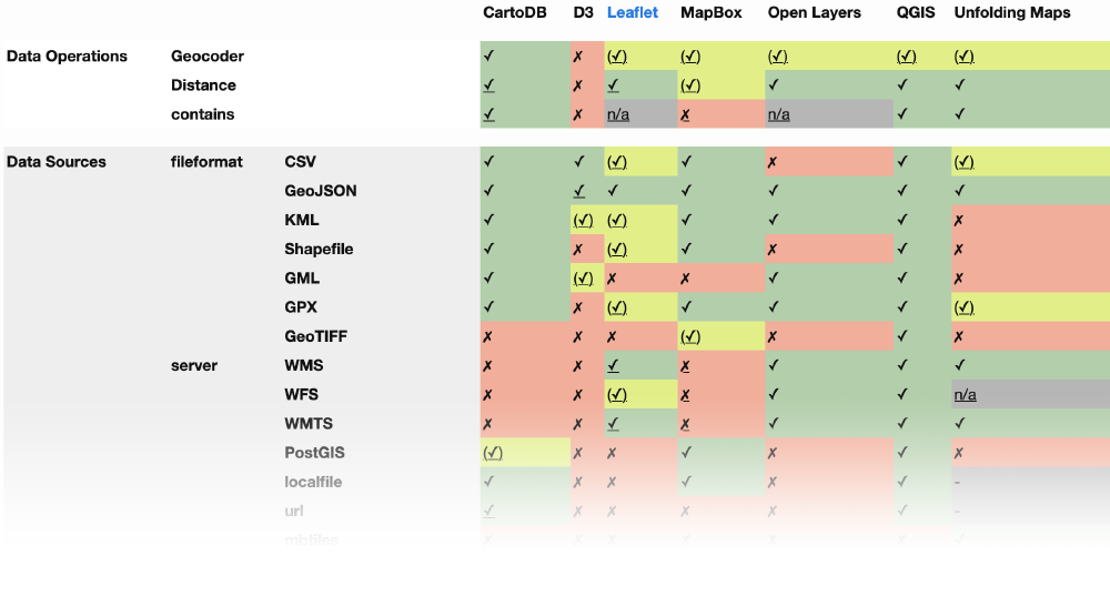
pdfUnfolding – A Library for Interactive Maps
In: SouthCHI, Human Factors in Computing and Informatics, Lecture Notes in Computer Science LNCS, volume 7946, pp. 497-513, Springer, 01/2013
Visualizing data with geo-spatial properties has become more important and prevalent due to the wide spread dissemination of devices, sensors, databases, and services with references to the physical world. Yet, with existing tools it is often difficult to create interactive geovisualizations tailored for a particular domain or a specific dataset. We present Unfolding, a library for interactive maps and data visualization. Unfolding provides an API for designers to quickly create and customize geovisualizations. In this paper, we describe the design criteria, the development process, and the functionalities of Unfolding. We demonstrate its versatility in use through a collection of examples. Results from a user survey suggests programmers find the library easy to learn and to use.
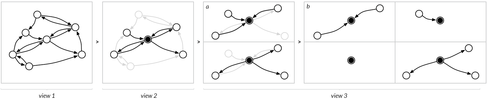
pdf Code Project SlidesInteractive Exploration of a Geospatial Network Visualization
In Proceedings of the 2012 ACM Annual Conference Extended Abstracts on Human Factors in Computing Systems, pp. 557-572, ACM, 10/2012
This paper presents a tabletop visualization of relations between geo-positioned locations. We developed an interactive visualization, which enables users to visually explore a geospatial network of actors. The multitouch tabletop, and the large size of the interactive surface invite users to explore the visualization in semi-public spaces. For a case study on scientific collaborations between institutions, we applied and improved several existing techniques for a walk-up-and-use system aimed at scientists for a social setting at a conference. We describe our iterative design approach, our two implemented prototypes, and the lessons learnt from their creation. We conducted user evaluation studies at the two on-location demonstrations, which provide evidence of the prototype usability and usefulness, and its support for understanding the distribution and connectivity in a geospatial network.
pdf SlidesSankey Arcs – Visualizing edge weights in path graphs
Eurovis 2012, Vienna, Austria, 5-8 June 2012, Eurovis 2012, pp. 55-59, Eurographics Association, 01/2012
Arc diagrams allow exploring relations and their strength between sequential nodes. Previous solutions suffer from displaying all arcs at the center of a node, which can lead to visual obstruction. We present a new technique, which extends the arc diagram technique by laying out the weighted edges of a node adjacent to each other. The aim of our Sankey Arc technique is to improve clarity, to enable users perceiving and comparing weighted edges in path graphs. The technique is illustrated using a dataset on travel paths in a public transit network.
pdf Slides