WanderVis
An interactive visualization tool for urban administration and city planners to better understand and explore population movement
WanderVis is an interactive visualization tool for urban administration and city planners to better understand and explore population movement. WanderVis is an interdisciplinary research project developed by computer science and design students of the University of Applied Sciences Mannheim, in cooperation with the City of Kaiserslautern, and the German Research Center for Artificial Intelligence (DFKI).
The Lord Mayor of Kaiserslautern praised the prototype as an “easy-to-use and visually pleasing tool, which can bring an enormous relief to city council and administration.”
The visualization system
The main view of the prototype consists of an interactive matrix showing population change. Each cell visualizes people moving to and from urban districts, separated by their citizenship.
Through the simple visualization in the form of a matrix three basic visual shapes stand out easily: horizontal patterns (such as A), vertical patterns (B), and single cells (C).
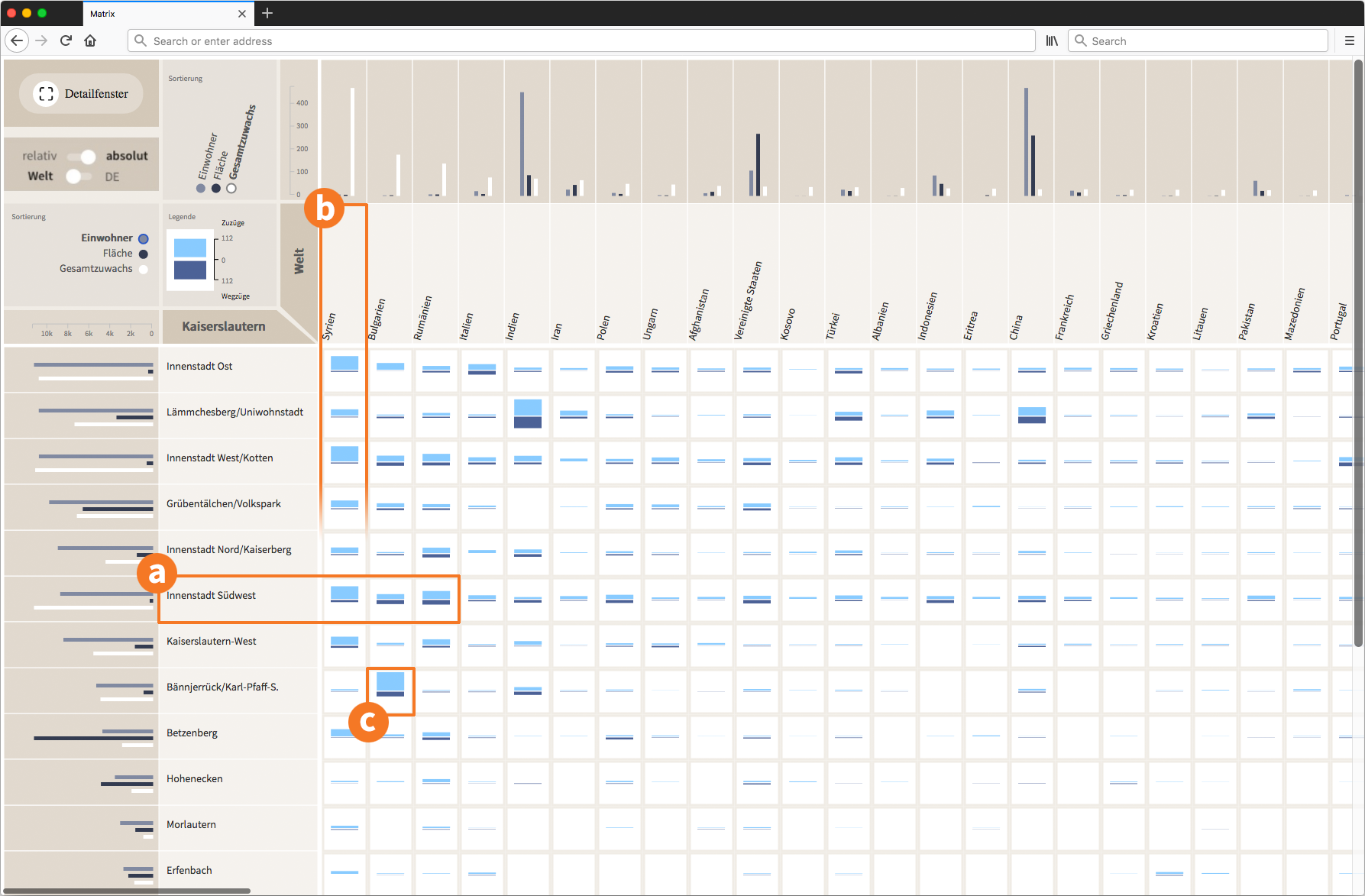
Interactive matrix with bar glyphs showing movement to and from districts (rows), subdivided by citizenship (columns).
Horizontal patterns draw attention to districts with notable movement characteristics, e.g. Innenstadt-Südwest, in which most persons from the top 3 citizenships move to or from (Fig. 1a). Vertical patterns point to citizenships with unusual movement characteristics, e.g. many Syrians move to Kaiserslautern, see Fig. 1b. The glyph of a single cell is noticeable particularly when it differs from their neighboring cells. For instance, in Fig. 1c it becomes apparent that in contrast to people with other citizenships, more Bulgarians move to Bännjerrück.
To ease investigating the data further, we provide a set of interactions such as sorting, filtering and details-on demand.
Design process
Learn more about the exploratory data analysis process and our design considerations over at the WanderVis project site.
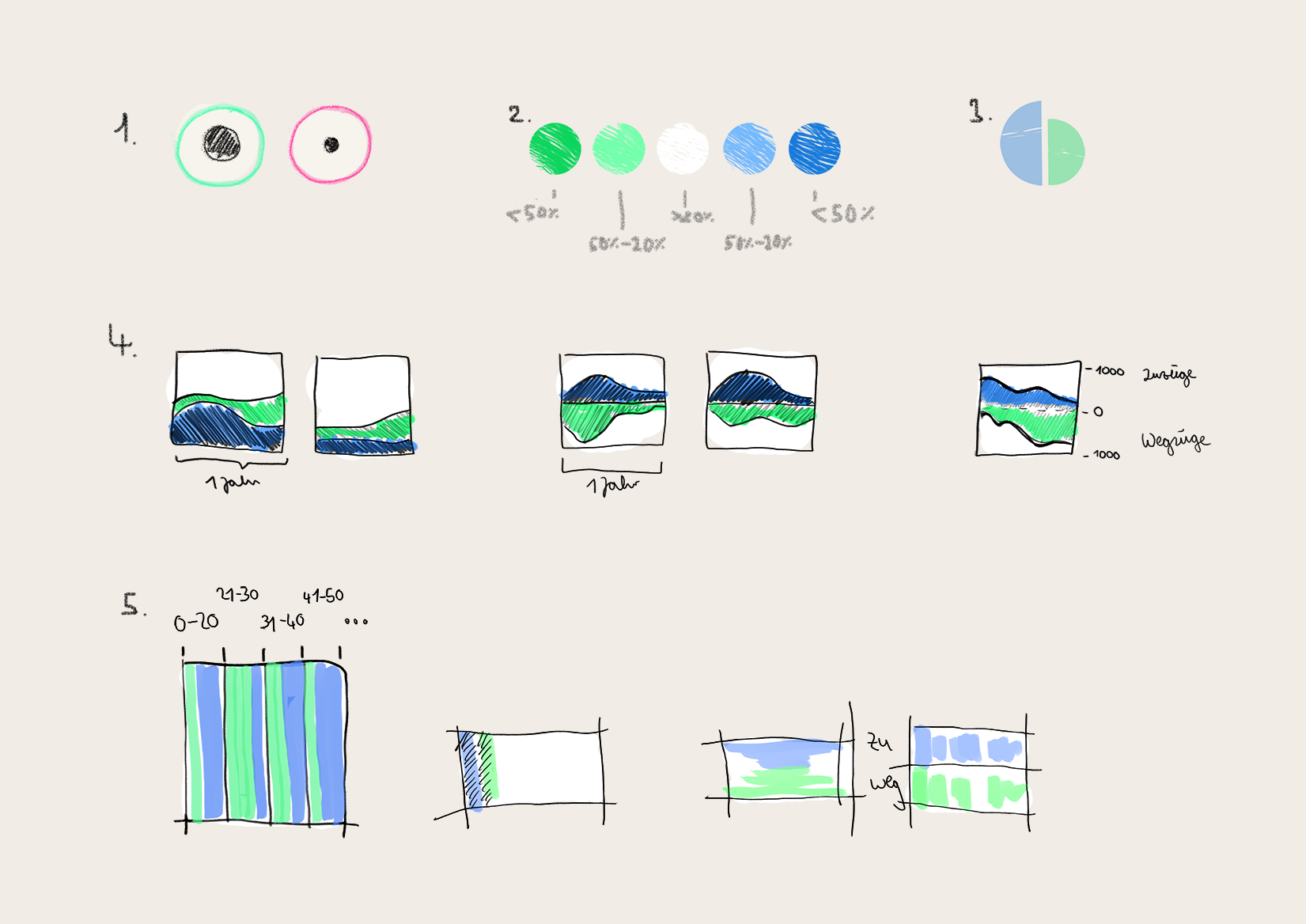
We investigated a variety of glyph designs visualizing in- and outflows. Variants of showing incoming and outgoing inhabitants combine inner circle and outer ring (1), a bivariate color schema (2), and simply split in two proportionally sized half circles. The small stacked area charts visualizes the change over a year (4). Another idea was to group the population movements to additionally show age distributions (5).
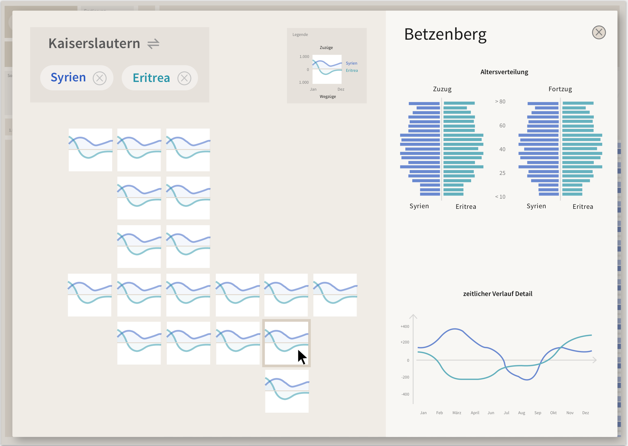
Mockup of a tile grid map showing migration for each district over time.
Implementation
The city administration prepared and anonymized official population data (Fig. 3 left), the DFKI integrated and aggregated them in an elasticsearch engine (center), and the HDIL analyzed the data, and visualized it in the prototype (right). Find more information on the data standards used, as well as on the software development of the prototype at our WanderVis project site.
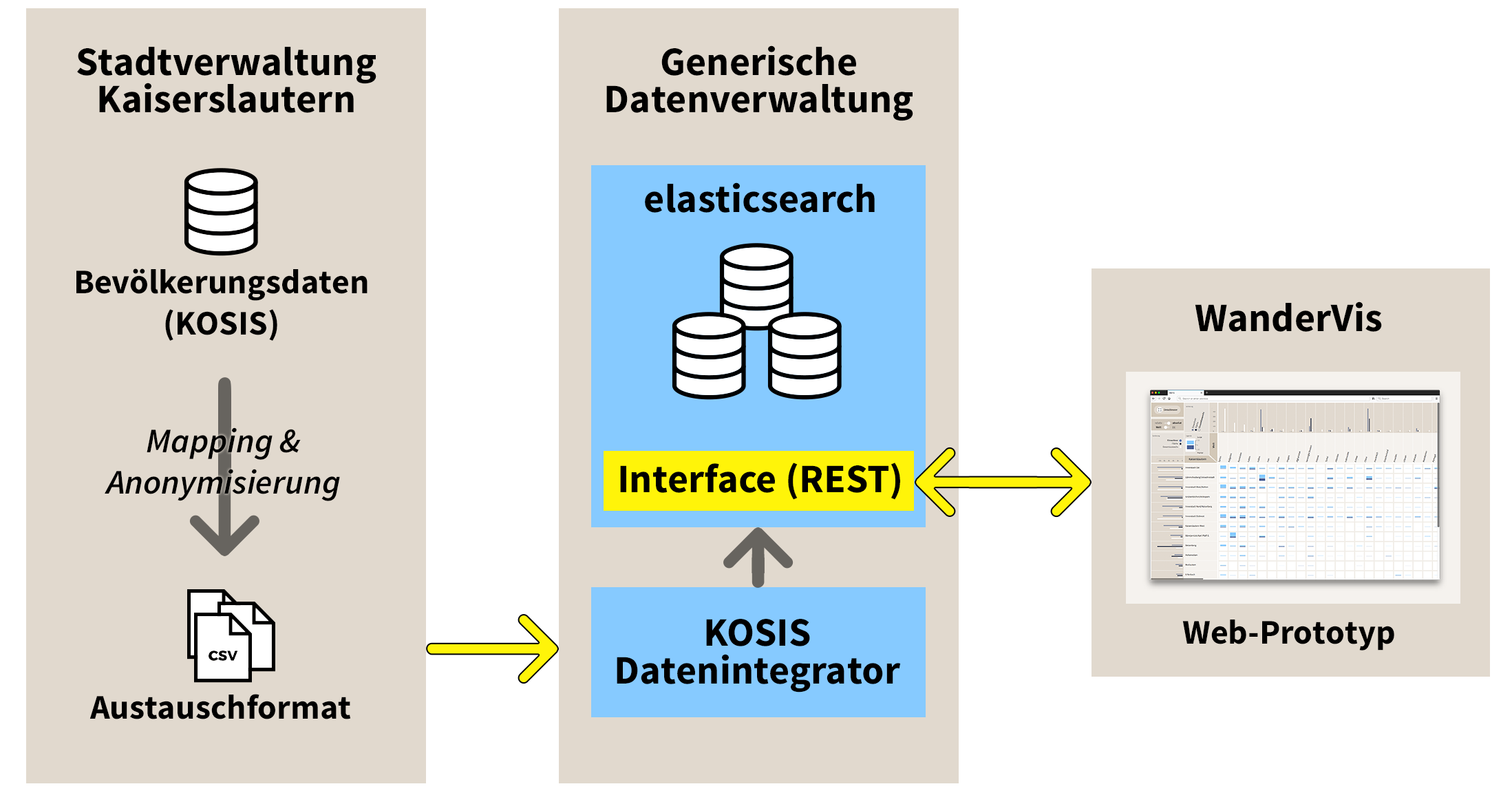
The data processing pipeline. The city administration prepares and anonymizes official population data (left), the DFKI integrates and aggregates them in an elasticsearch engine (center), and the HDIL is using the data in the visualization prorotype (right).