HeatHub
A visualization system for heat meter data for the urban development project Berlin TXL enabling stakeholders and the public to gain an overview of energy consumption at the former airport.
HeatHub is an interactive dashboard consisting of a set of carefully designed visualizations to show spatial, hierarchical and temporal dimensions of the data. HeatHub BTXL is an interdisciplinary research project developed by students of the Mannheim University of Applied Sciences in cooperation with the Urban Tech Republic, Berlin TXL.
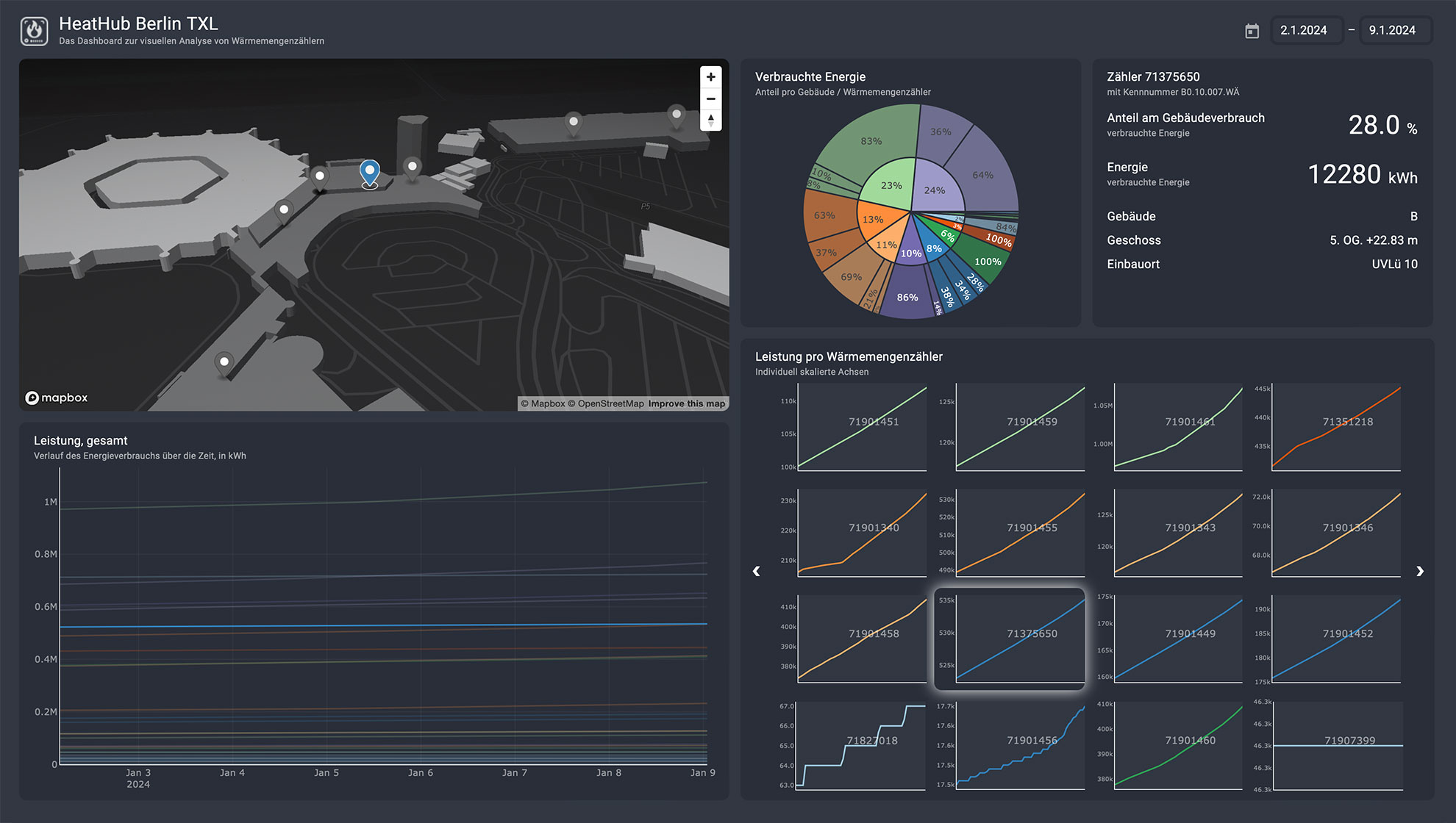
The HeatHub dashboard with a selected heat meter in building B.
The visualization system
The system is designed for analyzing and comparing the energy consumption of single heat meters, and the total consumption of each building. The dashboard consists of four main views:
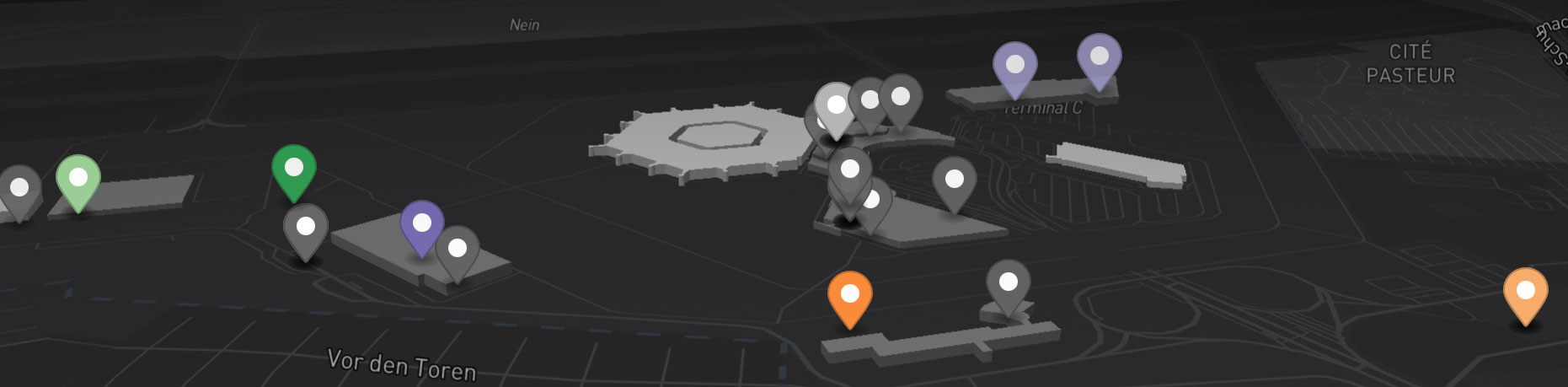
- An interactive 3D map visually represents the locations of each heat meter within their respective buildings, offering insights into their spatial distribution. This visualization also highlights the variability in infrastructure, showing buildings with multiple and others with fewer sensors.
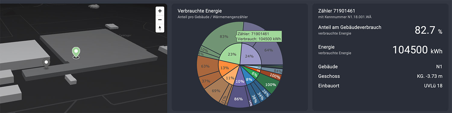
- A sunburst chart displays energy consumption in a hierarchical manner, allowing to see the proportions of individual buildings and the share of each heat meter within those buildings.
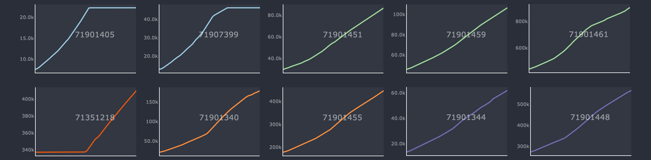
- A small multiple of line charts shows the increase over the selected time period, normalized to the meter’s initial status at the start date. Due to the vast variance in energy consumption across heat meters, we opted for individual scales for the small line charts to effectively display the general increase patterns for each heat meter.
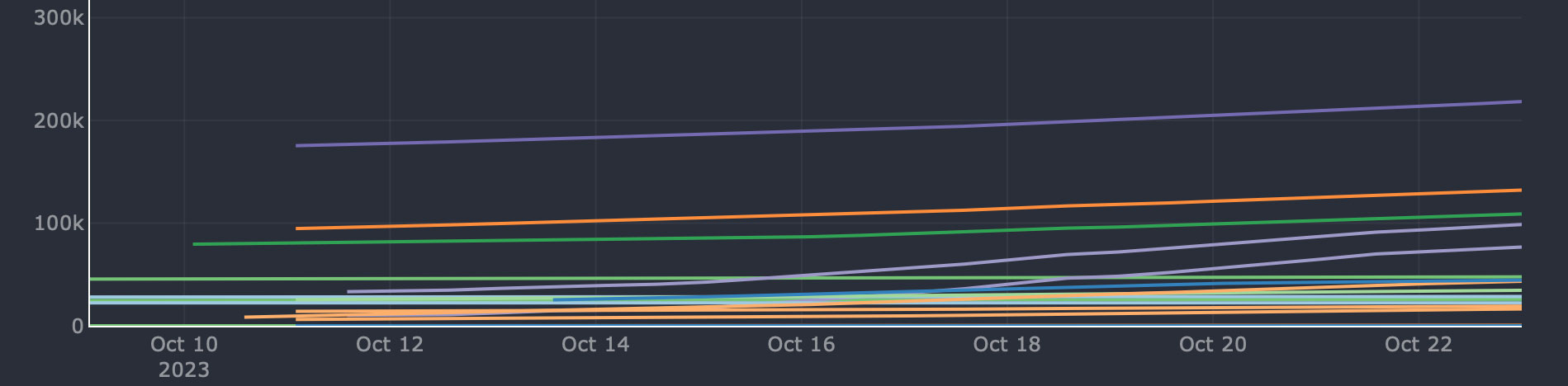
- A large line chart on the left, which presents the temporal energy consumption for all heat meters, employs a uniform scale to highlight the distinct clusters of energy use.
Across all views, a consistent color scheme is employed to denote the buildings. Furthermore, the upper right corner includes an information widget that displays key performance indicators (KPIs) and additional textual data for the currently selected building and/or sensor.
Data-driven insights
Peak energy consumption: The sunburst chart allows easy identification of the peak energy consumption at hangar N1, a site historically used for large plane repairs and projected to be a training facility for the Berlin fire brigade. Underscores the significant energy demand for maintaining such a specialized and high-utility space.
Spatial distribution of high-energy use: The interactive map reveals that high-energy consumption is not confined to a single location but is rather dispersed across the area. Notably, Terminal C - building A3 stands out as the only building housing two meters that each account for over 5% of the total measured energy consumption.
Trend in meter installations: The line chart shows an increase in the deployment of new meters from the beginning of October, illustrating the expansion of energy monitoring across the facility. This ramp-up indicates a growing emphasis on detailed energy management and data collection.
Consistency in use patterns: The small multiples shows that energy consumption patterns are often consistent among meters within the same building. This consistency suggests that buildings have characteristic energy use profiles. These patterns are more prominent for some time intervals than others.
The design process
The journey began with an insightful guest lecture by Martina Kuhaupt, introducing the topic and outlining the research challenges. This set the stage for a collaborative co-design workshop, where students, visualization researchers, and stakeholders from our partner came together and tackled questions related to heat meters. Participants sketched initial ideas utilizing visualization technique cards and adapted their visualizations with the aid of our urban data visualization (UDV) cards ensuring to consider important aspects of urban data visualization.
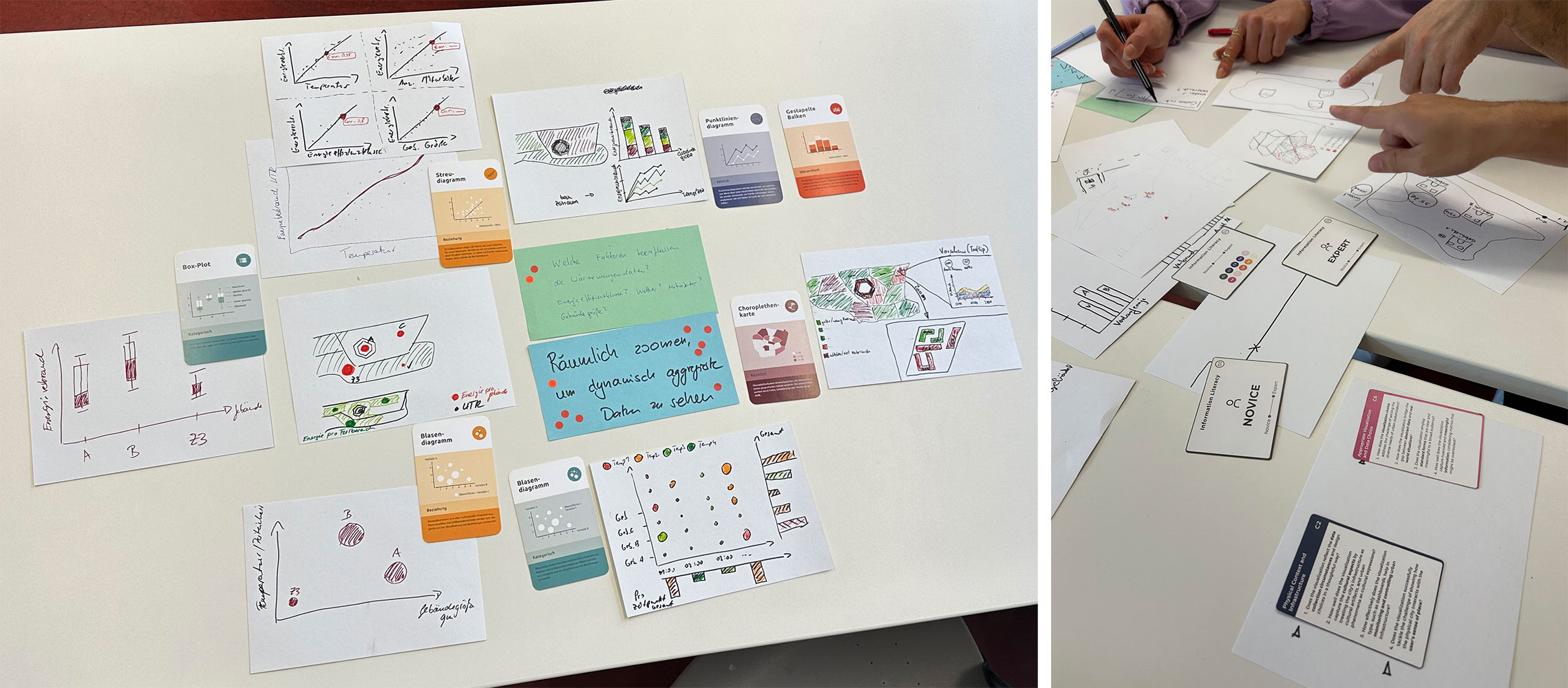
Questions and initial sketches of one workshop group (left). Participants discussing early visualization ideas with the help of the UDV card deck (right).
Following an extensive phase of data exploration, we showcased a series of promising real-world data visualizations to domain experts in the energy sector. This presentation sparked discussions on how to improve and fine-tune these visual representations. As the project progressed, we continuously refined our design decisions, aiming to enhance the dashboards’ effectiveness and visual appeal.
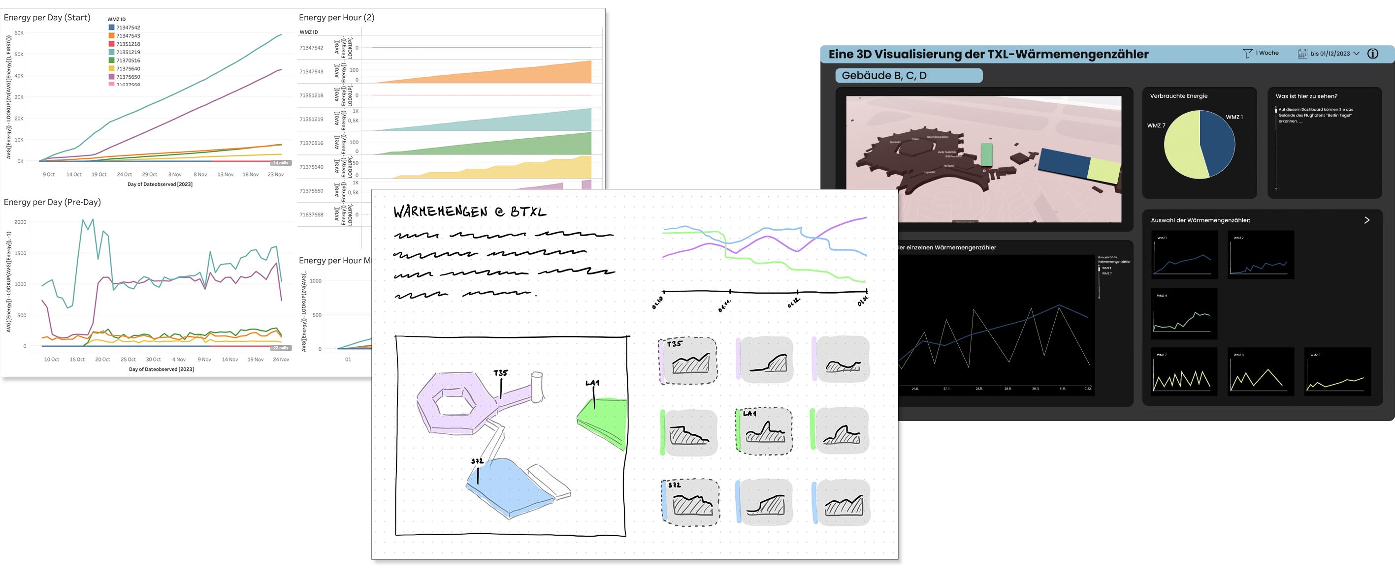
The visualizations from EDA, to concept sketch, to wireframe.
Finally, the students presented their work and demonstrated the prototype to the stakeholders at the exhibition center of the Urban Tech Republic, Berlin TXL. While visiting, we had the opportunity to inspect a heat meter in the underground area, tour the large hangar N1, and ascend the former airport tower — great fun to see the actual things we were analysing for so long.
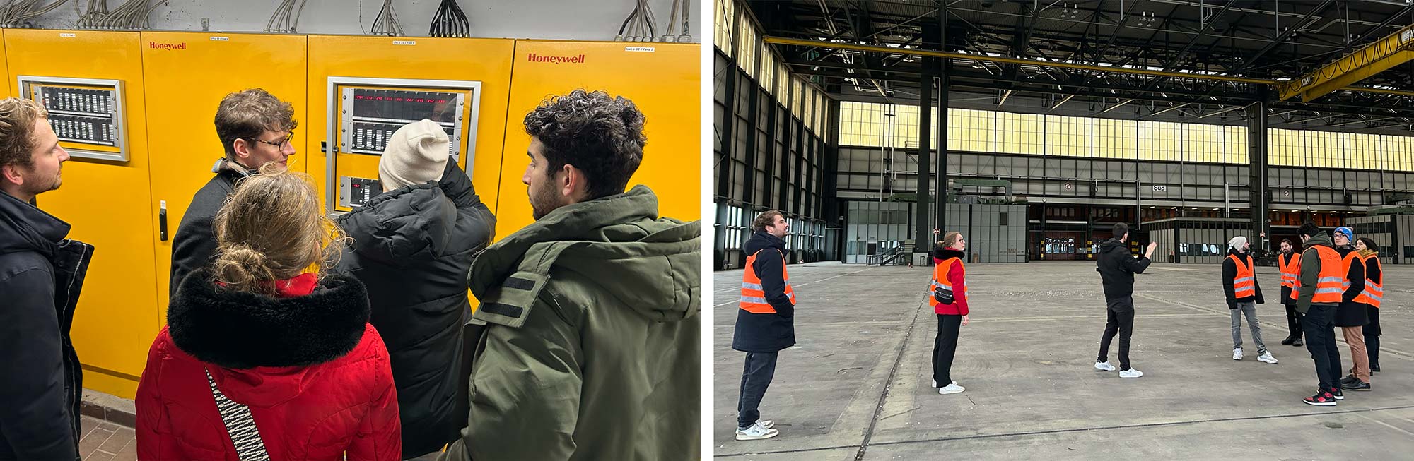
Students in front of a heating system, and marvelling at the size of the hangar.