Via Velox
Visualizing GPS-tracked bike rides to better understand cycling behaviour
Via Velox visualizes rides tracked and shared by cyclists through a mobile app. It shows a map and a calendar view side by side, and enables to interactively filter spatial and temporal properties of the rides allowing to analyze bicycle traffic, both for the public as well as for transport planning experts. Via Velox is an interdisciplinary research project developed by computer science and design students.
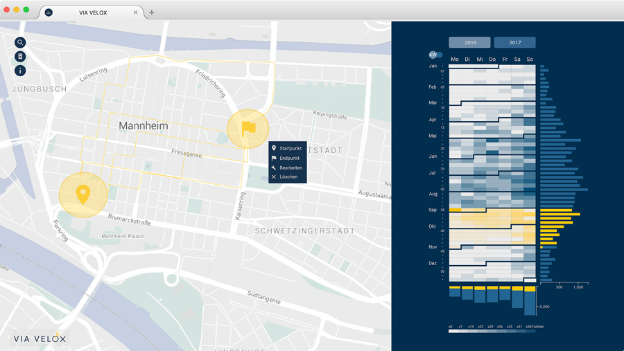
Via Velox with selected rides on the map (left) and filtered days in the frequency matrix (right).
The visualization system
The system provides two coordinated views: A map with bike trajectories, and a frequency matrix with a calendar heatmap and adjacent histograms. Users can select areas on the map to spatially filter bike trips, and select time spans in the calendar to investigate patterns such as commuting behavior.
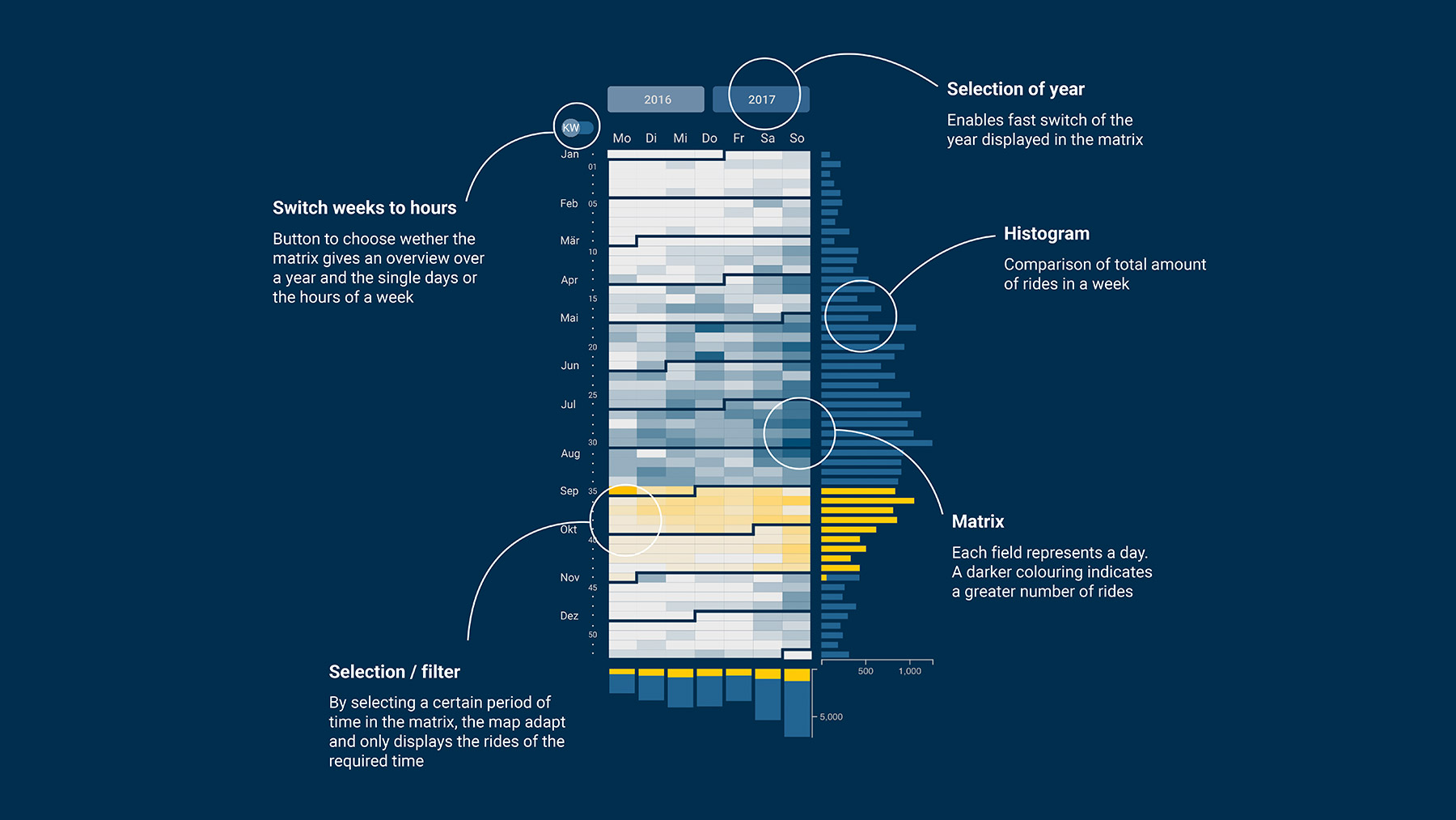
The temporal distribution of bike rides are visualized as a heatmap, with darker cells indicating higher amounts of rides. The calendar shows days of the week on the x-axis, while the y-axis can be set to either show weeks of the year, or the 24 hours of the day. Two marginal histograms on either side show aggregated frequency of trips for each weekday, as well as for each week, respectively each hour. By summarization, these histograms allow a more direct comparison of trends over the different temporal levels.
Interactions
Users can select areas within the map to filter bike trips which started or ended in that region. Such spatial filtering is mirrored in the frequency matrix, with all matching trips being displayed over time.
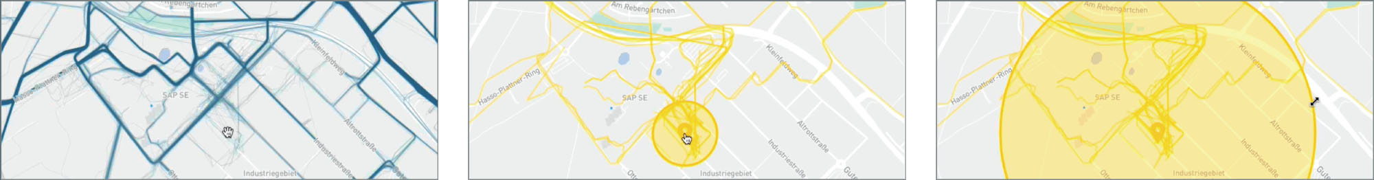
The interactive map can be zoomed and panned to investigate areas of interest. Blue trajectories show all recorded trips without any filters applied (left). By clicking anywhere on the map, users can select areas to filter bike trips which started or ended there. A translucent yellow circle is displayed whose size encompasses the geographic area of interest (center). Users can use direct manipulation to change these filters. By dragging the border of the circle, people can adapt the size of the circle to show more or fewer cycling paths (right).
Users can select time spans via the matrix. For instance, they can select all workdays, or choose specific times of day. Two histograms on the sides show aggregated frequency of trips for each weekday, and for each week. Highlighted histogram bars enable comparing the frequency of trips in a selected time with the overall distribution of all bike trips.
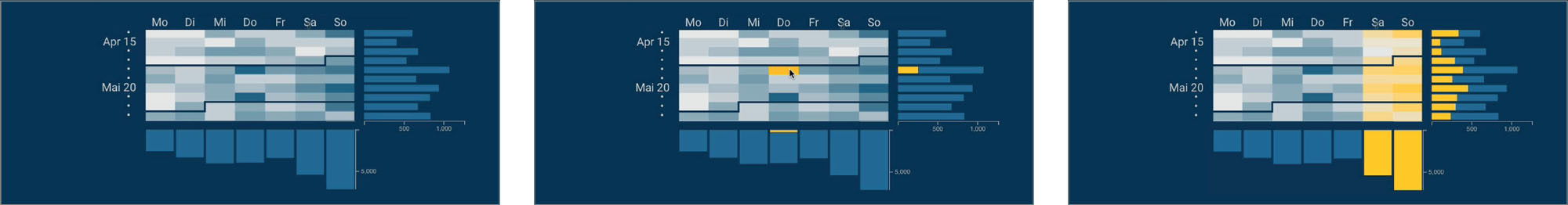
Calendar heatmap with histograms (detail, left). Users can select time spans via the calendar by clicking on single cells (center), or by select-dragging the mouse over the matrix. On the right, Saturday and Sunday were selected to analyze weekend cycling behaviour. After selecting time ranges, the histograms on each side get updated, as well. In this way, the highlighted parts of the histogram bars enable comparing the frequency of trips in a selected time range with the overall frequency.
Bike festival
Via Velox was exhibited publicly at a large urban festival (Fig. 5). This bicycle festival celebrated the 200th anniversary of the invention of the bike in Mannheim, and was open to the public. Our goal was to demonstrate Via Velox to interested people, to encourage cyclists to participate in our project by tracking their rides, and to discuss bike related themes with the public. As citizens could test the working visualization prototype, we also gathered first informal feedback
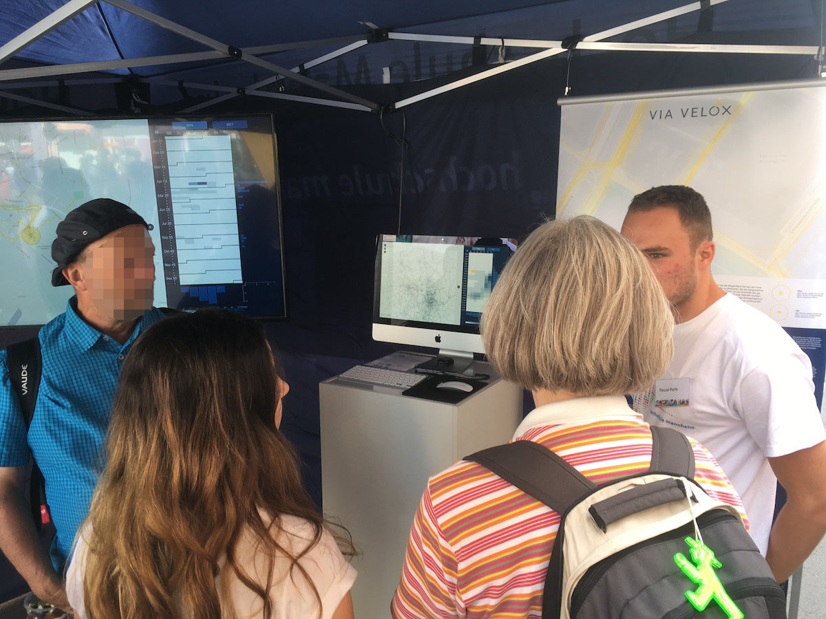
Citizens visiting our booth at a public bike festival in Mannheim.
Further info
See our poster presented at IEEE VIS 2018. Find more information on the design process, the technical implementation, and a selection of the insights made possible with the system at the Via Velox documentation site.
Via Velox was part of the SAP Next-Gen project “Bedarfsgerechte Radnetzplanung” (“demand-oriented planning of a cycling network”) with GeoNet.MRN as sponsor. Further partners besides the University of Applied Sciences Mannheim are the Database Research Group of the University Heidelberg, the Institute for Enterprise System at the University Mannheim, the GIS station at the Pädagogischen Hochschule Heidelberg and others.